Made By Matthews Software Design Services Page
Updated on
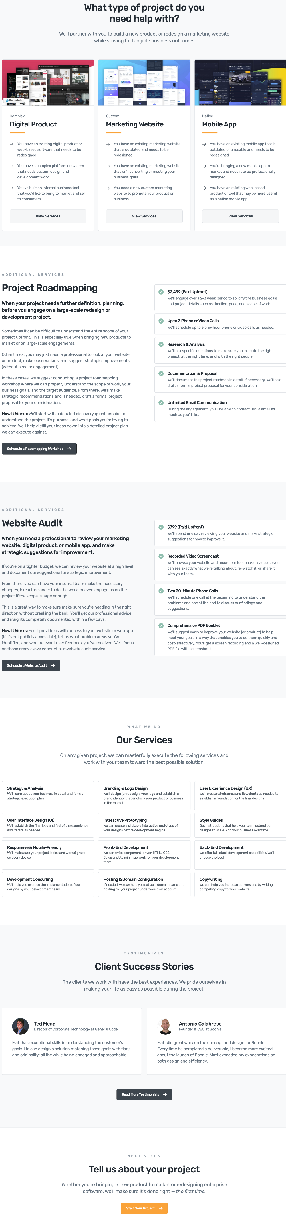
Ever land on a service page and feel totally lost? This design fixes that. It takes a long list of complex services and turns them into an easy step-by-step flow so visitors instantly know what to do next.
The Smart Page Structure
Each service type (like “Digital Product” or “Marketing Website”) is bucketed under a main category. From there, users drill down to exactly what they need, read a plain-English description, and hit “Start Project.” No clutter, no confusion.
Why It Works
- Reduces decision overload by chunking choices
- Keeps navigation intuitive and linear
- Uses action-driven buttons for each step
- Builds confidence with clear, descriptive copy
- Ends every path with a conversion point
Real-World Examples
- HubSpot groups tools by “Marketing,” “Sales,” “Service” to guide signups.
- Fiverr sorts freelancers by outcome (“Logo Design,” “Web Development”).
- Basecamp’s pricing page highlights just two clear options to ease decisions.
Analyzed by Swipebot
Loading analysis...
