Sarah Marie Anderson Copywriting Services Page
Updated on
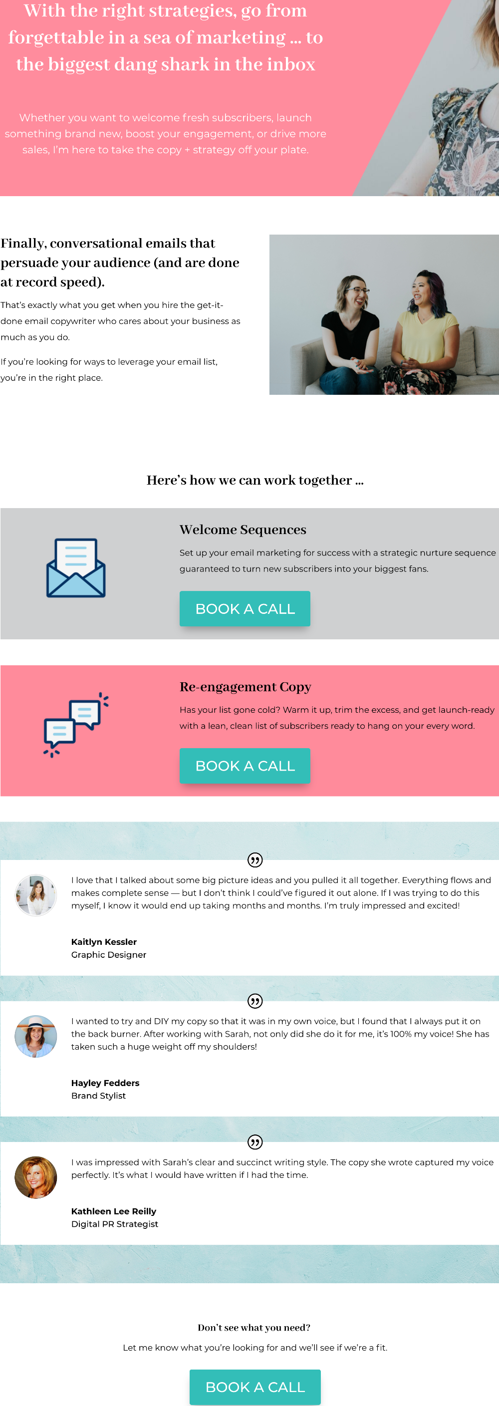
This services page is a masterclass in clarity. It shows two main offers front and center, then gives visitors a “something else?” option at the bottom. Simple. Obvious. Effective.
Why It Works
- Two main choices prevent overwhelm and guide action.
- Repeating “Book a Call” keeps the conversion path obvious.
- Testimonials sprinkled in build trust without shouting.
- Catch-all CTA at the end captures leads who don’t fit the main buckets.
- Friendly tone makes it human, not corporate.
Real-World Examples
- Basecamp keeps signup CTA the only action on the page.
- Marie Forleo’s programs page uses two offers + one general contact link.
- Copywriter Kira Hug highlights just 3 packages with clear CTAs.
- Webflow’s pricing page uses color blocks and consistent buttons just like this.
Analyzed by Swipebot
Loading analysis...
