Nerd Fitness Signup Payment Form
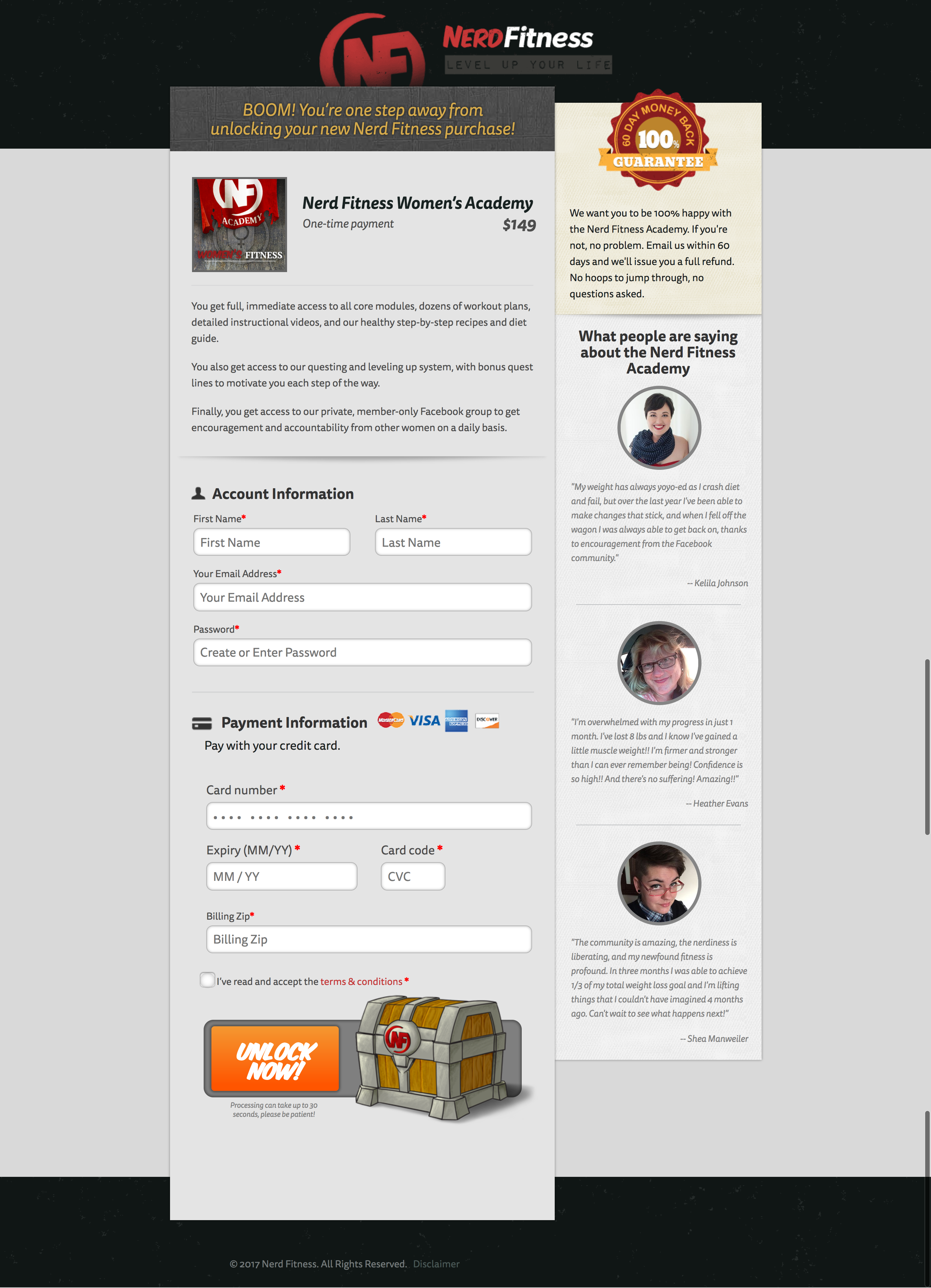
Most checkout pages are chaos. NerdFitness proves you can keep things clean, fun, and ultra-converting. Their page feels more like a quest screen than a form, yet every detail nudges visitors toward completing their purchase.
Marketing analysis
Only the must-have fields are shown. Meanwhile, the right side builds confidence: real member quotes, a big “100% Money-Back Guarantee,” and playful copy that matches the brand. The “Unlock Now” button nails their gamer tone and doubles as a strong call-to-action.
Why it works
- Cuts friction with a simple, one-page layout
- Adds emotional trust via testimonials and refund guarantee
- Keeps branding consistent with a “level up” theme
- Uses a reward-oriented CTA instead of a boring “Buy Now”
Examples
- Basecamp puts testimonials near signup forms for credibility
- Shopify shows familiar store logos at checkout for trust
- Codecademy fires motivation with “Start Learning Now”
Analyzed by Swipebot
Loading analysis...
