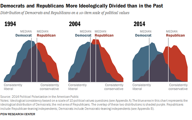
Most people say politics are getting more divided, but this chart from Pew makes you feel it. The curves pull apart year by year, turning an abstract idea into a punch-in-the-gut visual.
Why it Works
- Turns a vague trend into a measurable story
- Uses contrast and overlap to show tension
- Highlights the shift over time, giving built-in narrative
- Easy to grasp in seconds, zero reading required
Examples
- Spotify Wrapped: turns listening habits into colorful, sharable visuals
- Google Trends: simple curves show search popularity over time
- Airbnb’s “Belong Anywhere” map visuals made usage growth feel global, not geeky
- NY Times’ “Flatten the Curve” graphic made pandemic data understandable worldwide
Analyzed by Swipebot
Loading analysis...
