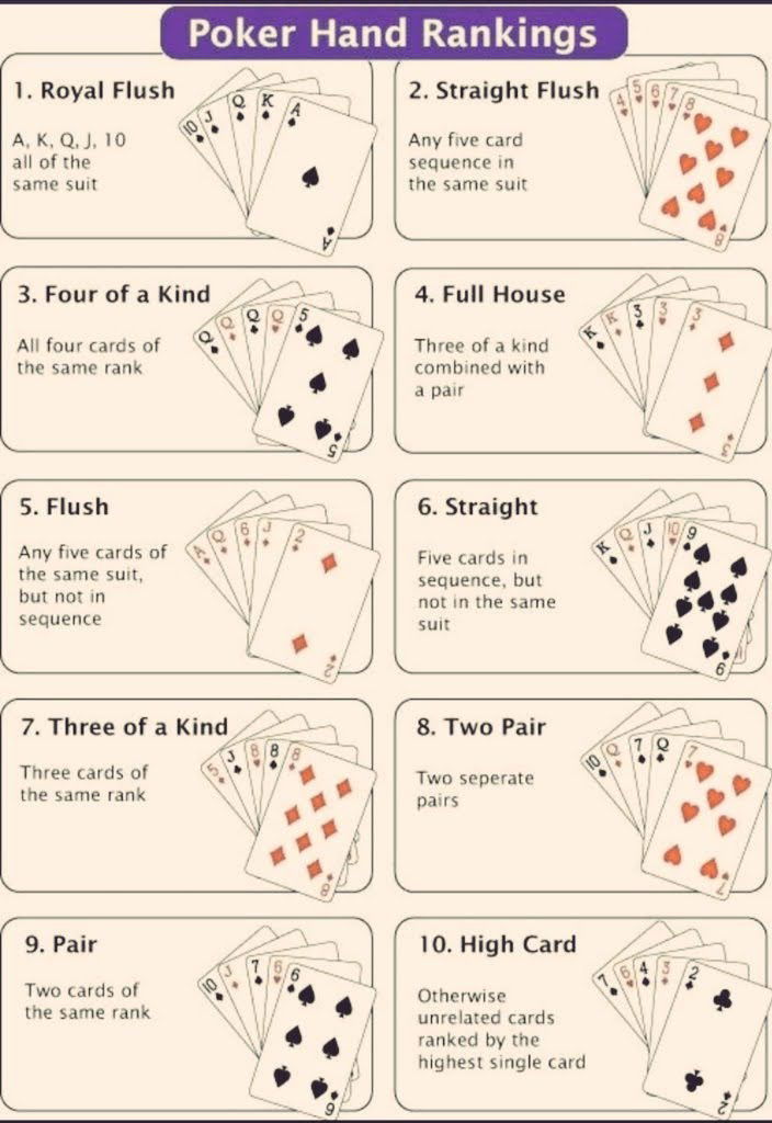
This poker hand rankings chart is a masterclass in clarity. In one glance, you can see a complex ranking system explained without needing a single extra word.
Why This Image Works
- It uses hierarchy and numbering to guide your eyes.
- Visual repetition (same layout for each hand) makes it easy to compare.
- Minimal text, maximum meaning.
- Compact but complete—no fluff.
Examples of Simple Visual Systems
- Google’s “Material Design” cards show UI principles at a glance.
- IKEA’s assembly guides use step-by-step images instead of text.
- Nutrition labels summarize complex data in one box.
- Airplane safety cards communicate life-saving info in seconds.
Great marketers should aim for this level of simplicity: instant understanding.
Analyzed by Swipebot
Loading analysis...
