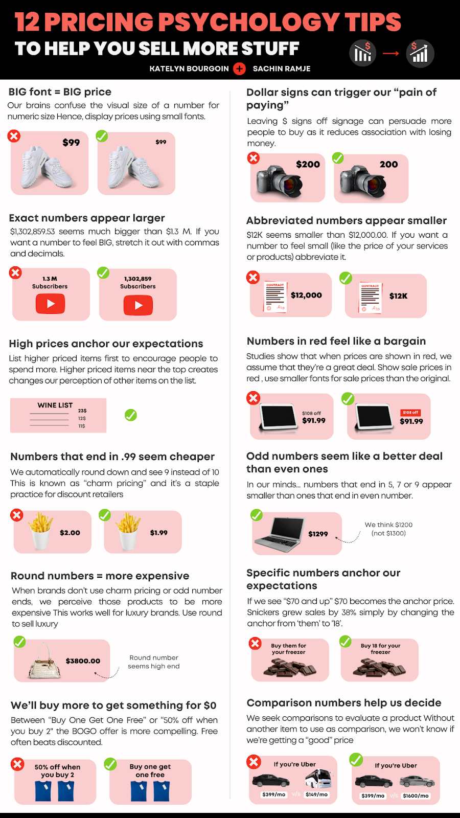
This graphic by Katelyn Bourgoin is like a mini-MBA in pricing. It shows how tiny visual tweaks can make the same price feel cheaper, bigger, or fancier. Let’s break down why your numbers matter more than you think.
Marketing Analysis
Every pixel in a price tells a story. Font size, decimals, color, and number endings all trigger subconscious cues. Smaller fonts feel cheaper. Red prices feel like deals. Round numbers scream luxury. Mix them right, and you can steer buyer perception without changing the actual price.
Why It Works
- Uses anchoring to set expectations
- Reduces pain of paying (drop the $ symbol)
- Leverages charm pricing (end in .99)
- Aligns visual and mental cues
- Builds contrast effects for better deal perception
Examples
- Apple lists high-end models first to make mid-range options seem affordable
- Amazon shows “was $129 / now $99” to use anchoring and charm pricing
- Starbucks rounds prices for premium drinks to convey luxury
- Walmart uses odd numbers (.97, .99) to push value perception
- Uber shows competitor prices side-by-side to frame value
Analyzed by Swipebot
Loading analysis...
