Anatomy of an AI SaaS Landing page
Updated on
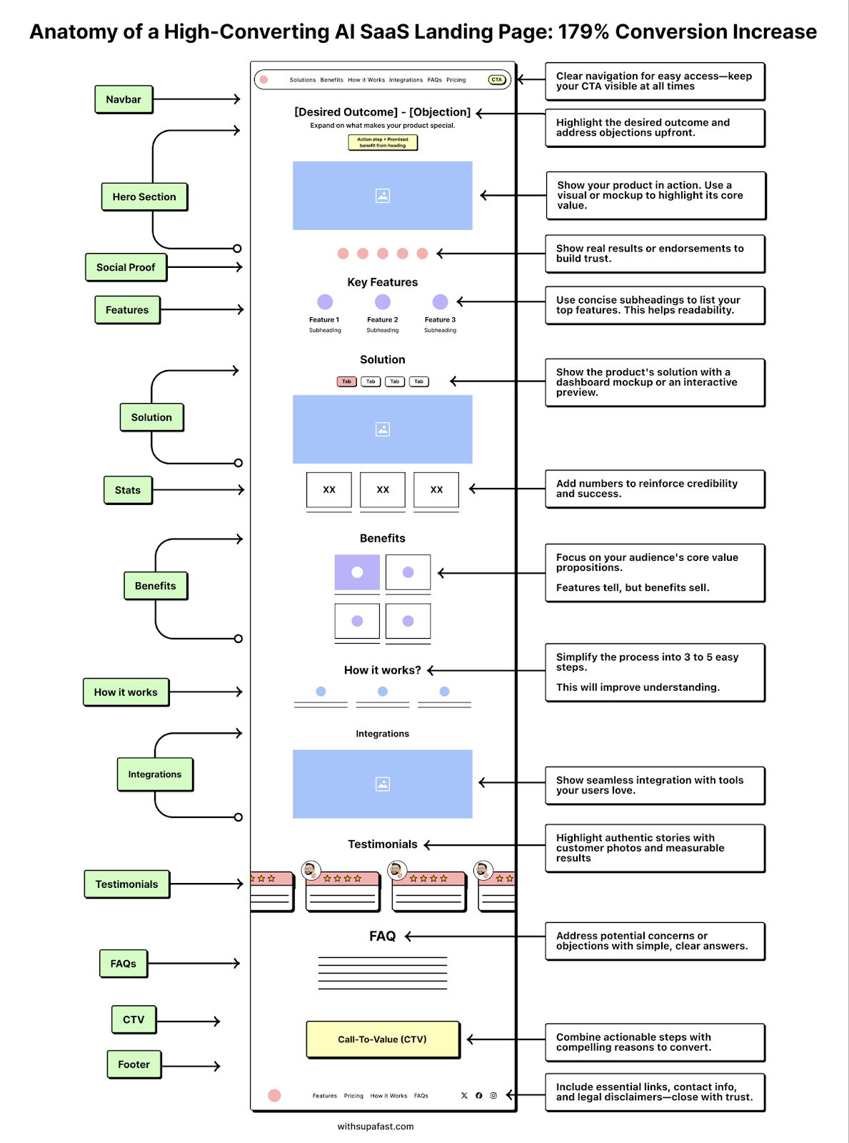
This landing page teardown maps every move that took a SaaS company from “okay” to “wow” — a 179% conversion spike. Each section works like a smart salesperson, leading visitors step-by-step toward “Start Free Trial.”
Marketing Anatomy
The page layout connects psychology with clean design: clear value-first headlines, visual proof, real testimonials, and CTAs that stay visible. It’s not flashy — it’s frictionless. Every scroll down feels like a “yes” waiting to happen.
Why It Works
- Tackles objections right in the headline
- Visuals make the product feel real
- Testimonials build instant trust
- Simple flow reduces decision fatigue
- CTA pairs emotion with logic
Real-World Wins
- Dropbox: Simplified copy + 1 CTA = +10% signups
- Basecamp: Benefits-first copy doubled conversions
- Calendly: Product-in-action visuals boost comprehension instantly
Analyzed by Swipebot
Loading analysis...
