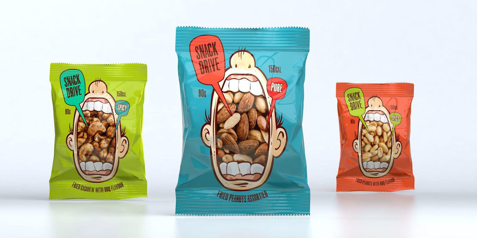
Loud, funny, and impossible to miss—that’s Snack Drive’s packaging by Tough Slate Design. Each bag shows a cartoon mouth wide open, “eating” the nuts inside. The product itself becomes part of the illustration. That’s pure marketing gold.
Why This Design Pops
- The packaging tells a story without a single word.
- It uses visual humor to create instant recognition.
- The nuts are the hero, not hidden behind design fluff.
- Bright colors make each flavor easy to spot.
- It breaks the boring snack aisle look.
Real-World Parallels
- M&M’s turned flavors into mascots with real personality.
- RXBar showed its ingredients loud and proud.
- Liquid Death wrapped plain water in punk-metal attitude.
Smart design makes you stop, smile, and grab it. That’s how you snack your way to sales.
Analyzed by Swipebot
Loading analysis...
.png?width=3840&quality=80)