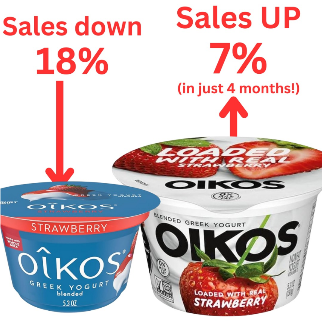
Oikos didn’t change their yogurt recipe. They just changed the packaging colors and focus. The dull blue tub got swapped for a bright, juicy strawberry image that screams “real fruit inside.” Result? Sales jumped by 7% in just four months.
The Marketing Lesson
Packaging isn’t decoration. It’s your first salesperson on the shelf. Oikos proved that visuals influence perception and trust way more than words.
Why It Works
- People buy with their eyes first.
- “Real fruit” signals freshness and quality.
- Red and white colors grab attention faster than blue.
- The new design clearly shows what’s inside.
- Makes shoppers feel the flavor before buying.
Real-World Twins
- Tropicana’s sales dropped 20% after removing the orange image.
- Coca-Cola’s red can is instantly recognizable worldwide.
- Ben & Jerry’s packaging shows chunky mix-ins for appetite appeal.
- RXBar’s clear ingredient list design boosted brand trust fast.
Analyzed by Swipebot
Loading analysis...
