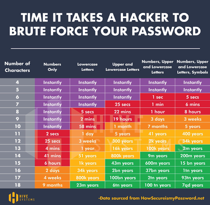
This Hive Systems chart turns a mountain of data into pure clarity: how long it takes to brute-force a password. One glance and you instantly get it—short, simple passwords equal instant doom.
Marketing analysis
This chart nails what every marketer dreams of: taking something complicated and making it stupidly easy to understand. Each color cues urgency and safety. The layout reduces dozens of rows of data into a single story that sticks.
Why it works
- Uses visual contrast to show risk fast
- Simplifies a complex topic into one decision: make stronger passwords
- Color gradient tells an emotional story from danger to safety
- Numbers are concrete and relatable
Examples
- Spotify Wrapped compresses a year of listening into one colorful chart.
- Google’s Year in Search turns vast data into emotional storytelling.
- Airbnb’s charts show complex trends in one visual snapshot.
Analyzed by Swipebot
Loading analysis...
