Verizon vs AT&T Coverage Map
Updated on
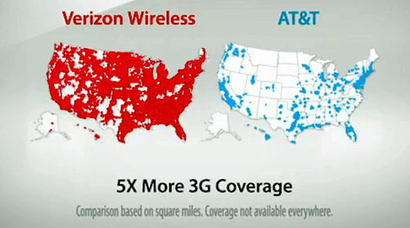
Sometimes one great visual says everything your customer needs to know. Verizon’s map campaign did exactly that. Instead of a wordy pitch about "better coverage," they showed it with bold red versus blue maps.
The Genius Behind the Map
The ad turns vague claims (“5X more coverage”) into proof with one glance. The brain processes visuals way faster than text, so viewers instantly get Verizon’s edge.
Why This Works
- Visual contrast makes the message undeniable
- Simple comparison removes confusion
- Numbers back up the visual without overexplaining
- Creates an emotional gut reaction: “I want the red network”
Real-World Examples
- Apple’s “I’m a Mac” ads simplify comparison through characters
- Pepsi’s blind taste test visualized taste preference
- Dollar Shave Club used one funny video to destroy complexity around razors
Analyzed by Swipebot
Loading analysis...
