Wealthfront visually displays the diverse investment options they offer
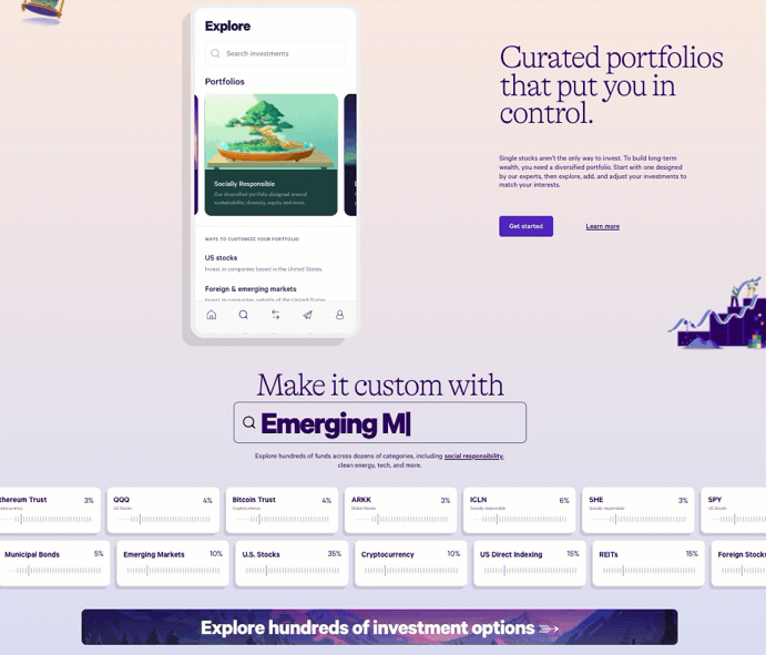
Wealthfront nails the first impression. Their homepage animation isn’t just pretty—it shows exactly how customizable investing can be, without needing any words to explain it.
The Marketing Magic
The animation visualizes control. It transforms something abstract (a "diversified portfolio") into something easy to see and feel. Instead of walls of jargon, you get sliders, icons, and movement—inviting users to play with investment options.
Why It Works
- Turns complexity into clarity
- Uses motion to demonstrate customization
- Builds confidence through visual control
- Makes data feel friendly (not intimidating)
Real-World Twins
- Canva’s animated templates show creativity within reach
- TurboTax’s guided visuals simplify filing taxes
- Grammarly’s live suggestions visualize progress instantly
- Robinhood’s easy sliders make trading look approachable
Analyzed by Swipebot
Loading analysis...
