What mobile websites should look like
Updated on
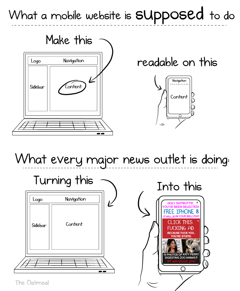
This comic nails it. Mobile sites are supposed to make content easier to read. Instead, most news outlets cram ads, popups, and clickbait into every pixel.
What’s Happening Here
The Oatmeal shows how a simple desktop layout becomes a jumbled mess on mobile. Rather than streamlining, sites overload users with distractions chasing ad revenue instead of retention.
Why It Works (as satire)
- Highlights contrast: clean design vs cluttered chaos
- Uses humor to amplify frustration
- Shows, doesn’t tell—visual punchline lands instantly
- Taps into shared pain of bad UX
Real-World Examples
- Forbes’ mobile splash screen delaying content for 5+ seconds
- CNN’s homepage with full-screen autoplay ads
- BuzzFeed optimizing for scroll depth instead of readability
Good UX = happier users = more time on site. Simple math most publishers ignore.
Analyzed by Swipebot
Loading analysis...
.png?width=3840&quality=80)