What mobile websites should look like
Images
Aug 10, 2020
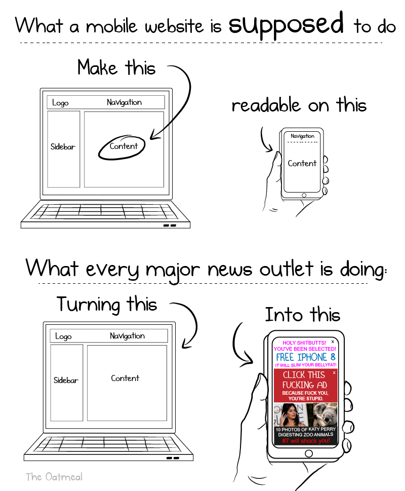
This is great because it highlights how bad news outlets' mobile sites are.
Instead of focusing on content and usability, they prioritize obnoxious ads and clickbait.


This smart typewriter is great for distraction free writing that can sync to your computer.
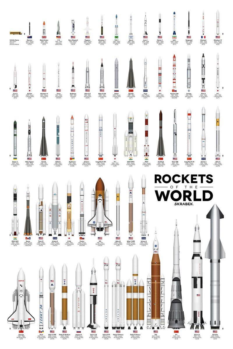
Graphic showcasing all the rockets of the world.
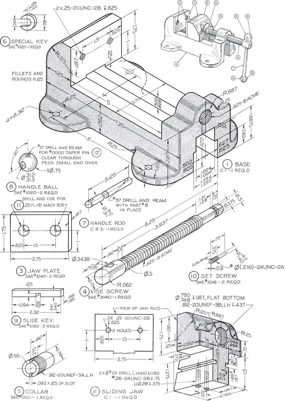
The detail in this hand-drawn technical drawing was incredible; each callout and measurement was meticulously crafted by hand.It's amazing that...

This image highlights the key components of a Boeing 737 cockpit, using callouts to guide you through its layout.
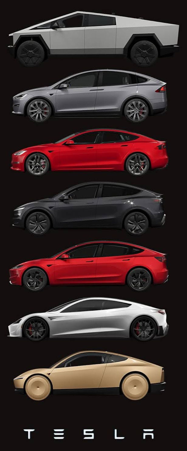
A sleek visual lineup of every Tesla model — from the futuristic Cybertruck to the minimalist next-gen concept — showcasing...

Funny graphic illustration Ohms law.
Search for a command to run...
This smart typewriter is great for distraction free writing that can sync to your computer.
Graphic showcasing all the rockets of the world.
The detail in this hand-drawn technical drawing was incredible; each callout and measurement was meticulously crafted by hand.It's amazing that...
This image highlights the key components of a Boeing 737 cockpit, using callouts to guide you through its layout.
A sleek visual lineup of every Tesla model — from the futuristic Cybertruck to the minimalist next-gen concept — showcasing...
Funny graphic illustration Ohms law.
Search for a command to run...