Wistia Home Page
Updated on
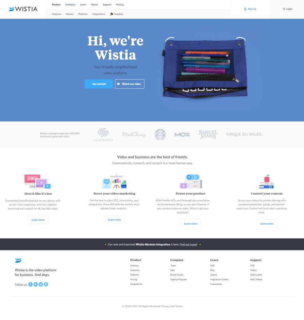
Wistia’s homepage isn’t just clean—it’s engineered to grab your eyeballs. Visual heatmaps show visitors instantly lock eyes on the “Hi, we’re Wistia” headline, then move straight to the blue “Get started” button. That’s design science at work.
The hidden marketing magic
The quirky pencil pouch image does more than look cute. It subtly points your attention toward the main copy and CTA. Bright blue contrasts, whitespace, and balanced layout tell your brain exactly where to go next—without you realizing it.
Why it works
- Headline and CTA dominate the visual path
- Contrast makes the action button pop
- The image feels personal, creating curiosity
- Whitespace prevents distraction overload
Other brands using the same move
- Dropbox: blue background and clean white button
- Slack: playful illustration framing hero copy
- Airbnb: warm photo directing eyes to “Start your search”
Analyzed by Swipebot
Loading analysis...
