Snap App Home Page
Updated on
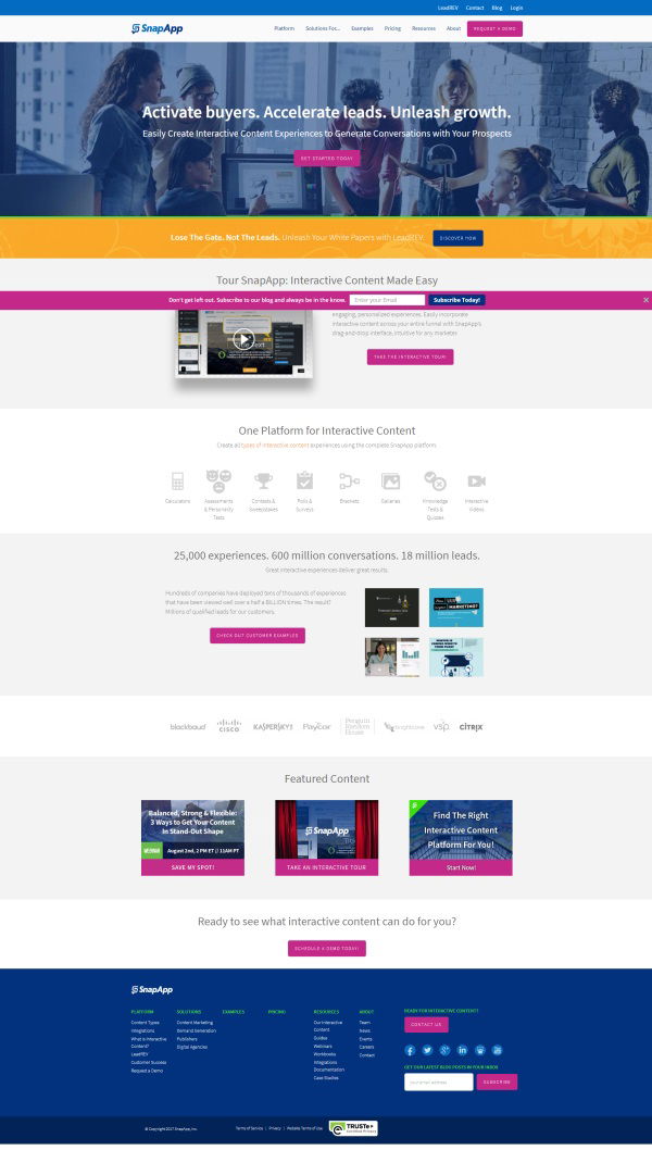
SnapApp didn’t just build a nice-looking homepage—they built a data-powered attention magnet. Using eye-tracking heatmaps, they discovered exactly where people look, linger, and ignore. Then they placed the good stuff (headline, CTAs, and video demo) right in those hot red zones. Smart design meets science.
Marketing Science in Action
The color map tells the story: red = instant attention, yellow = interest, blue = snooze. SnapApp used this to make sure every key message sits where eyeballs naturally go first.
Why It Works
- Uses the F and Z reading patterns
- Puts CTAs in “hot” visual zones
- Cuts decision fatigue with guided flow
- Makes high-value content impossible to miss
Real-Life Proof
- HubSpot boosted clicks 25% by moving CTAs into heatmap sweet spots
- Amazon keeps “Buy Now” in the top-right eye zone
- Airbnb tweaks hero image brightness to guide attention
Analyzed by Swipebot
Loading analysis...
