1928 Aspironal Cold and Flu
Updated on
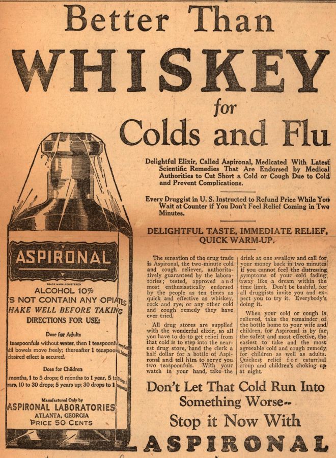
Yep, even in the 1920s they understood visual hierarchy. This old Aspironal ad starts with a giant “WHISKEY” headline that grabs instant attention—then marches your eyeballs straight down to the bottle, and finally to the call to action. It’s like a landing page before landing pages were a thing.
Marketing Analysis
The ad hooks with a shock word, then redirects readers to a healthier choice. Every design layer—the bold headline, centered product shot, and closing paragraph—pulls attention downward toward the sale.
Why It Works
- Contrast headline (“WHISKEY”) sparks curiosity
- Big text leads the eye through the page naturally
- The bottle adds visual trust and tangibility
- Repetition cements the brand name
- The CTA uses fear and relief to spark buying
Examples
- Coca-Cola keeps its logo visible in every frame for recognition
- Apple guides eyes from product photo to “buy” button
- Tide ads lead attention to one strong emotional image
Analyzed by Swipebot
Loading analysis...
.png?width=3840&quality=80)