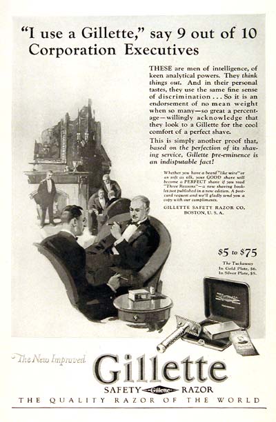
1962 Gillette Razor Print Ad

Print Ads
Aug 10, 2017
1926gillettesafetyrazor
In this 1962 print ad, Gillette uses social status to advertise the need for men to use their razors. Red areas are most likely to attract attention, followed by Yellow/Orange areas, and Blue areas. Areas that have no color overlay are unlikely to attract visual attention. The Regions Report graphically represents the likely distribution of visual attention during preattentive processing.   Any area or object that is identified as one of the first 4 predicted fixations is highly likely to be noticed at first glance, regardless of its 1, 2, 3, or 4 order.

Image Description

The 1962 Gillette print ad features a group of well-dressed men in a corporate setting, emphasizing the use of Gillette razors as a status symbol. It includes a heatmap overlay indicating where viewers' attention is likely drawn, with red, yellow/orange, and blue areas highlighting the most to least attention-grabbing elements.

Positive Aspects

The ad cleverly leverages the authority and social proof of "9 out of 10 Corporation Executives" to persuade viewers, associating Gillette razors with intelligence and discernment. The visual elements are strategically placed, with attention to detail in how viewer gaze is directed, demonstrated by the accompanying heatmaps and visual sequences.

Key Takeaways

  • Social Proof: The ad uses the endorsement of respected executives to build credibility.
  • Visual Hierarchy: Color overlays and strategic text placement guide viewer attention effectively.
  • Status Association: Purchasing Gillette is linked to prestige and intelligence.
  • Historical Context: Reflects 1960s advertising trends focusing on authority and social status.

Additional Insights

This ad is a textbook example of how companies used authority figures to build trust in their products. The emphasis on executives reflects the era's cultural values, where being clean-shaven was synonymous with professionalism. Plus, it's a fascinating glimpse into the psychology of advertising—how color and placement can manipulate where we look!