1923 A1 Sauce Print Ad
Updated on
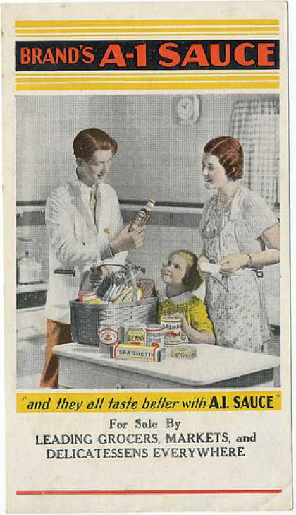
This old A1 Sauce ad is proof that smart design beats fancy tools. No Photoshop, no filters—just pure visual flow that makes your eyes move exactly as planned.
Marketing analysis
Your eyes start with the faces (mom and kid), jump to the bold red “A1 Sauce” logo, and end on the tagline. It’s basically emotional storytelling guided by composition. The ad uses a natural Z-pattern that feels effortless but directs your focus perfectly.
Why it works
- Faces instantly pull attention
- Red and contrast make the logo pop
- Tagline ties emotion to product use
- Layout follows natural eye movement
- Family warmth = brand stickiness
Examples
- Coca-Cola anchors visuals with red to dominate attention
- Apple adds a human touch by showing hands in product shots
- Pampers pairs smiling babies with soft tones to boost trust and warmth
Analyzed by Swipebot
Loading analysis...
