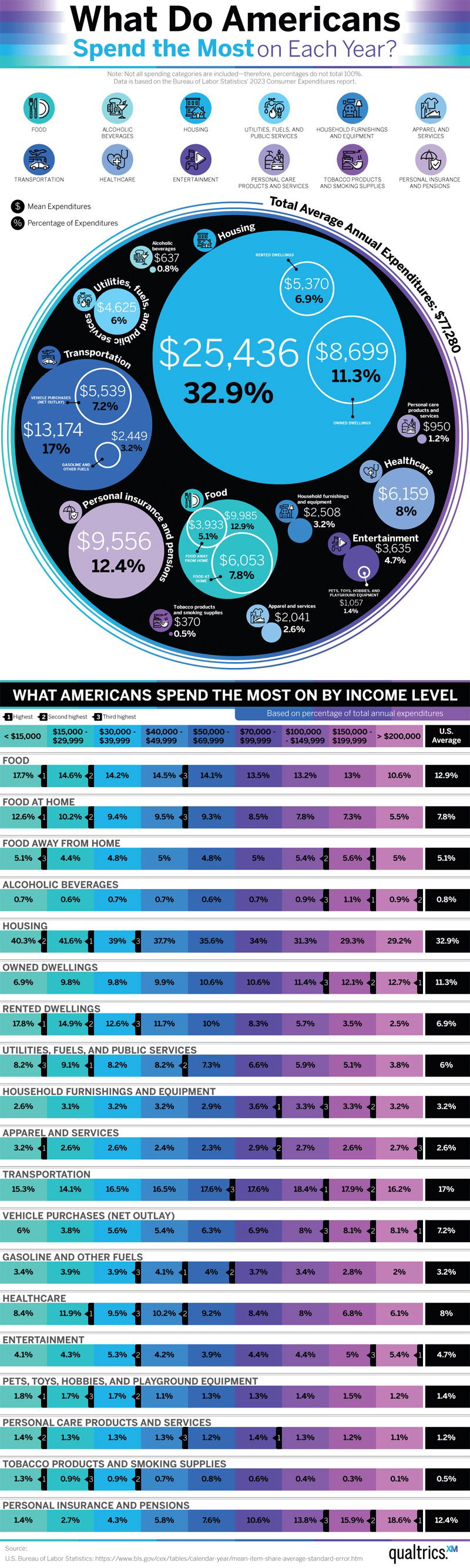
Image Description
The image is a bar chart illustrating the forecasted distribution of global advertising spending by media for 2021. Internet leads with 52%, followed by Television at 27%, and other media like Outdoor, Newspaper, Radio, Magazines, and Cinema making up smaller percentages.
Positive Aspects
This chart provides a clear visual representation of advertising trends, making it easy to see the dominance of internet advertising. It's concise and effectively communicates the information without overwhelming the viewer.
Key Takeaways
- Internet advertising is predicted to capture over half of the global ad spending in 2021.
- Television remains a significant medium but is considerably less than internet spending.
- Traditional media like newspapers, radio, and magazines are expected to receive a smaller share of ad budgets.
Additional Insights
The shift towards internet advertising highlights the increasing importance of digital platforms. This trend reflects consumer behavior changes, as more people spend time online. Businesses should consider leveraging digital marketing strategies to stay competitive.