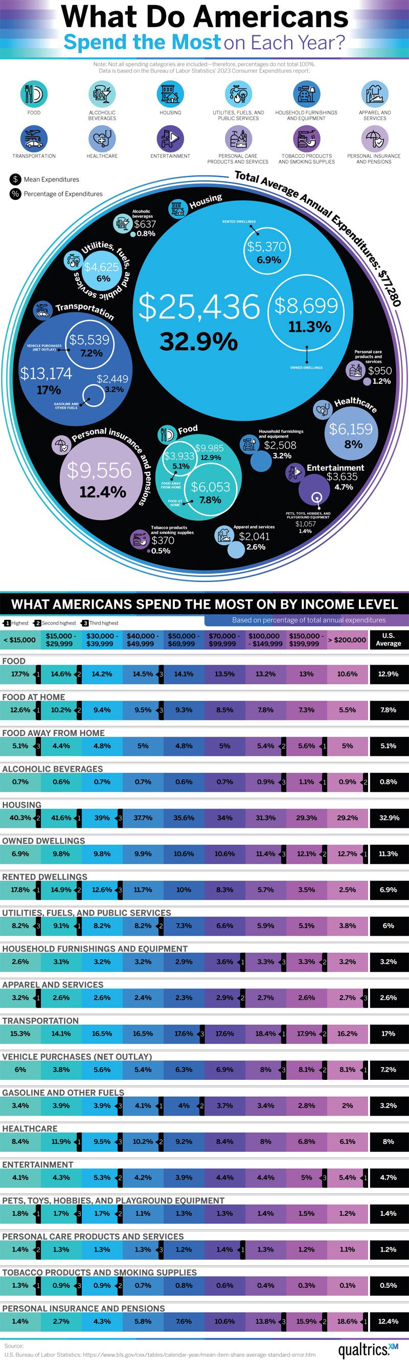
Ever wondered where your target audience’s wallet really goes? This chart from Qualtrics shows that the biggest slice of American spending isn’t food or travel—it’s housing. And it’s not even close.
Marketing Analysis
Housing eats up 32.9% of spending. Transportation and insurance follow. Food and healthcare make up smaller but still solid chunks. That tells marketers a simple truth: your product competes not just with your category—but with rent, gas, and groceries.
Why It Works
- Clear visual hierarchy: big circles = big spending.
- Color-coded by income level for quick comparison.
- Anchored in real data, not guesses.
- Broad data scope reveals emotion: security, mobility, stability.
Examples
- Netflix targets “entertainment” budgets under 5% of income.
- Zillow ads resonate because housing is the top expense.
- Uber Eats taps into both “transportation” and “food” categories.
- Geico’s message fits consumers thinking about “insurance” costs already hitting 12%.
Analyzed by Swipebot
Loading analysis...
