50 Stats Examples
Dive into the world of data-driven marketing with Swipefile's Stats category. Discover statistics that inform, inspire, and validate your marketing strategies. From consumer behavior to industry benchmarks, use these insights to craft more effective campaigns and make data-backed decisions.
Most Popular in Stats
Why Your Marketing Analytics Are Lying
Most marketers obsess over dashboards, but very few ask the only question that matters: is this actually making us money?...
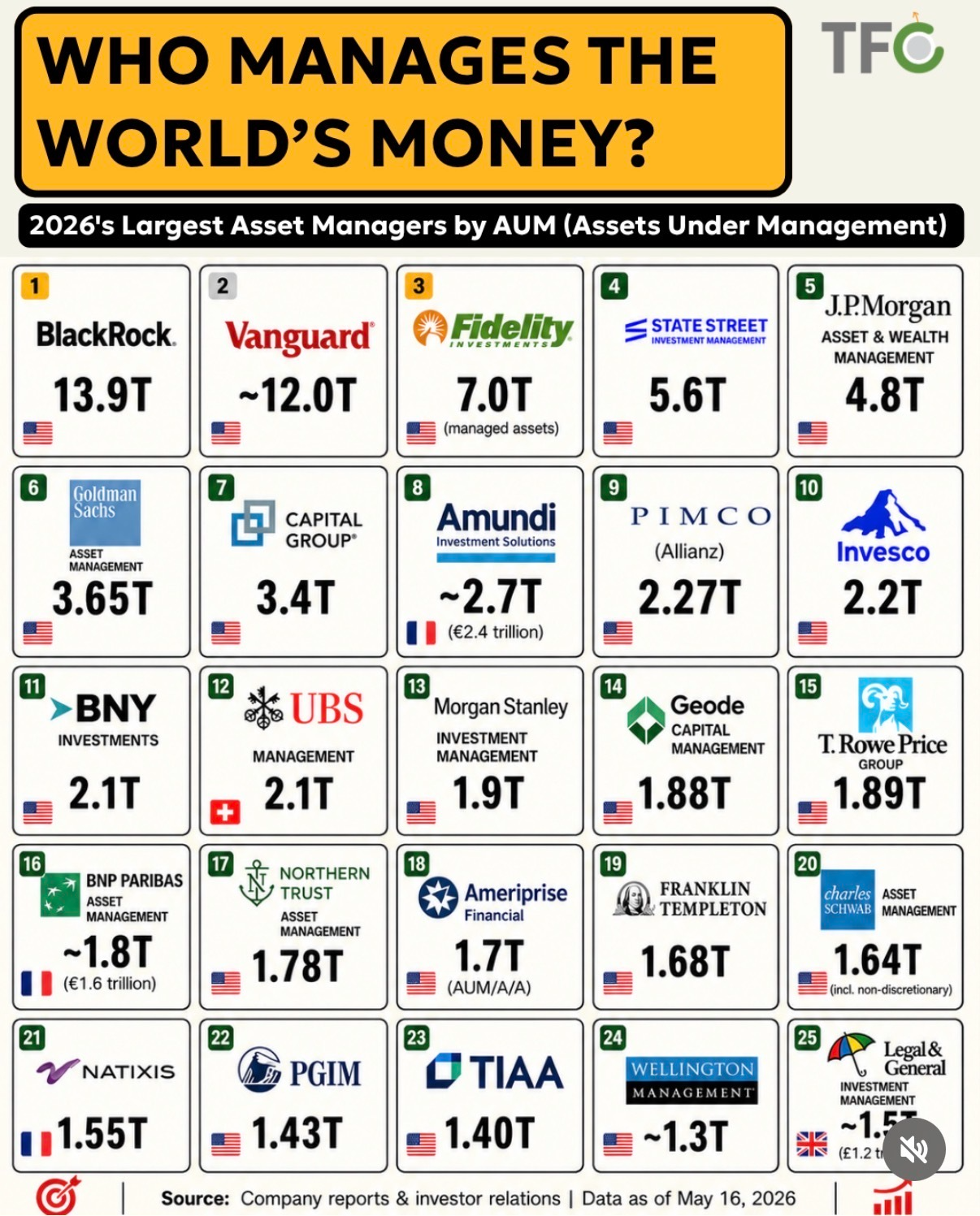
2026 Rankings: Who Manages The World's Money
This 2026 rankings chart is basically a map of who quietly runs the global piggy bank. Trillions of dollars, index...
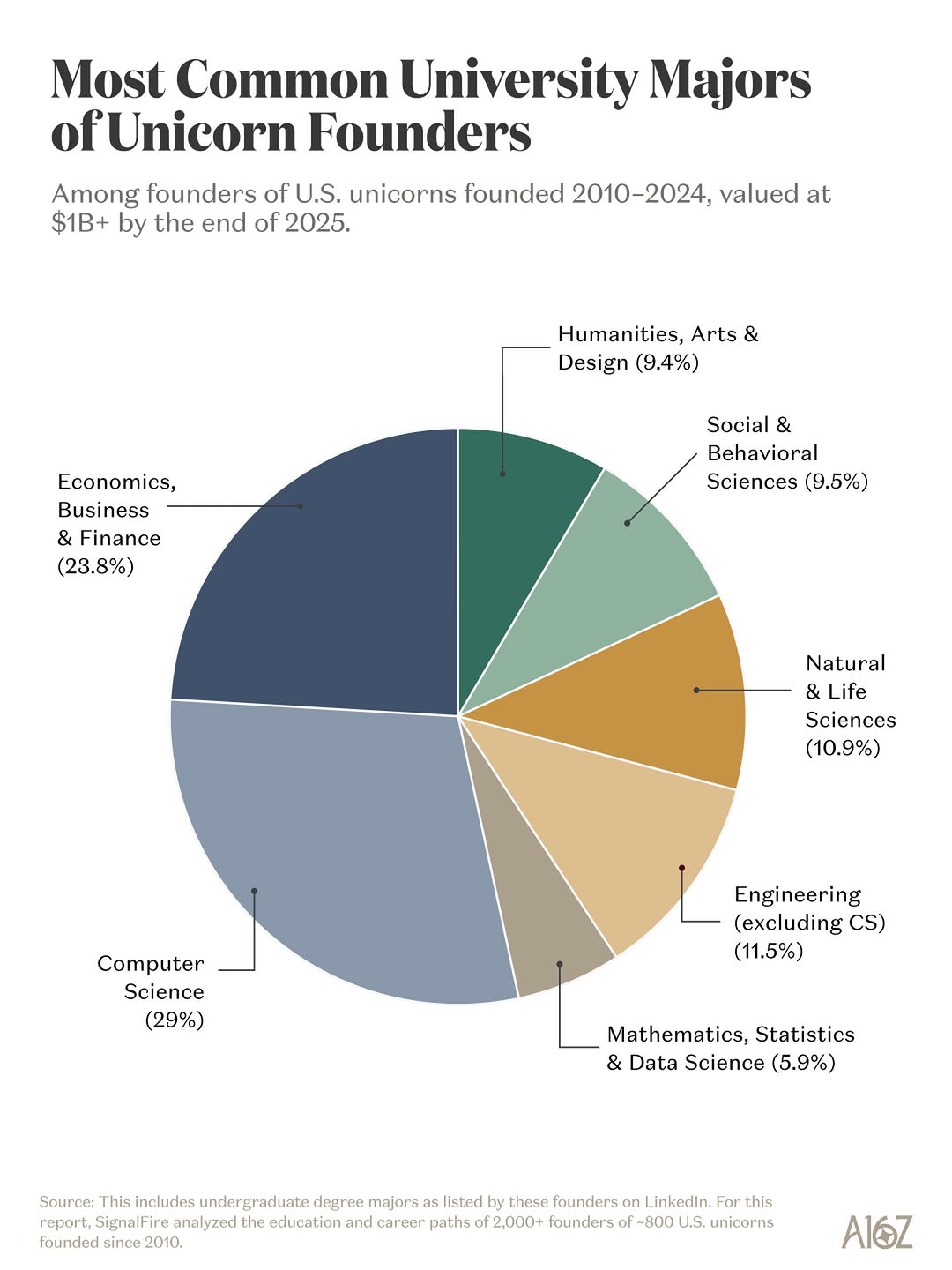
Majors That Produce Unicorn Founders
Everyone thinks every unicorn founder was a dropout hacker in a hoodie. The chart in this Instagram post blows that...

Colleges That Actually Produce S&P 500 CEOs
If you strip away the glossy brochures and campus drone shots, one question matters to a lot of ambitious students:...

Old Tools, Huge Volume: 10M Onion Broker
This reel shows a family in a cozy, cluttered office where a simple spreadsheet and a couple of phones quietly...
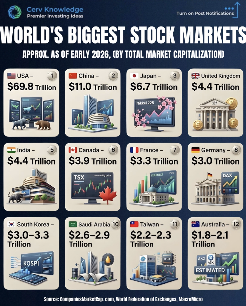
Top 12 Exchanges That Move Global Capital
This visual of the world’s biggest stock markets is basically a map of where global money sleeps at night. In...

ROI Confidence Across Channels
This chart from NP Digital reveals a brutally honest truth: marketers trust some channels way more than others when it...
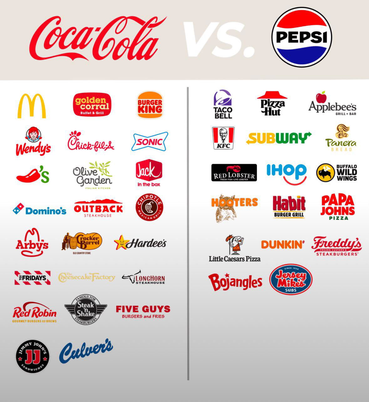
Coca-Cola -vs- Pepsi Exclusive Brand Deals
Coke vs. Pepsi isn’t just about taste. It’s about territory. The image shows the battlefield: fast food and restaurant chains...
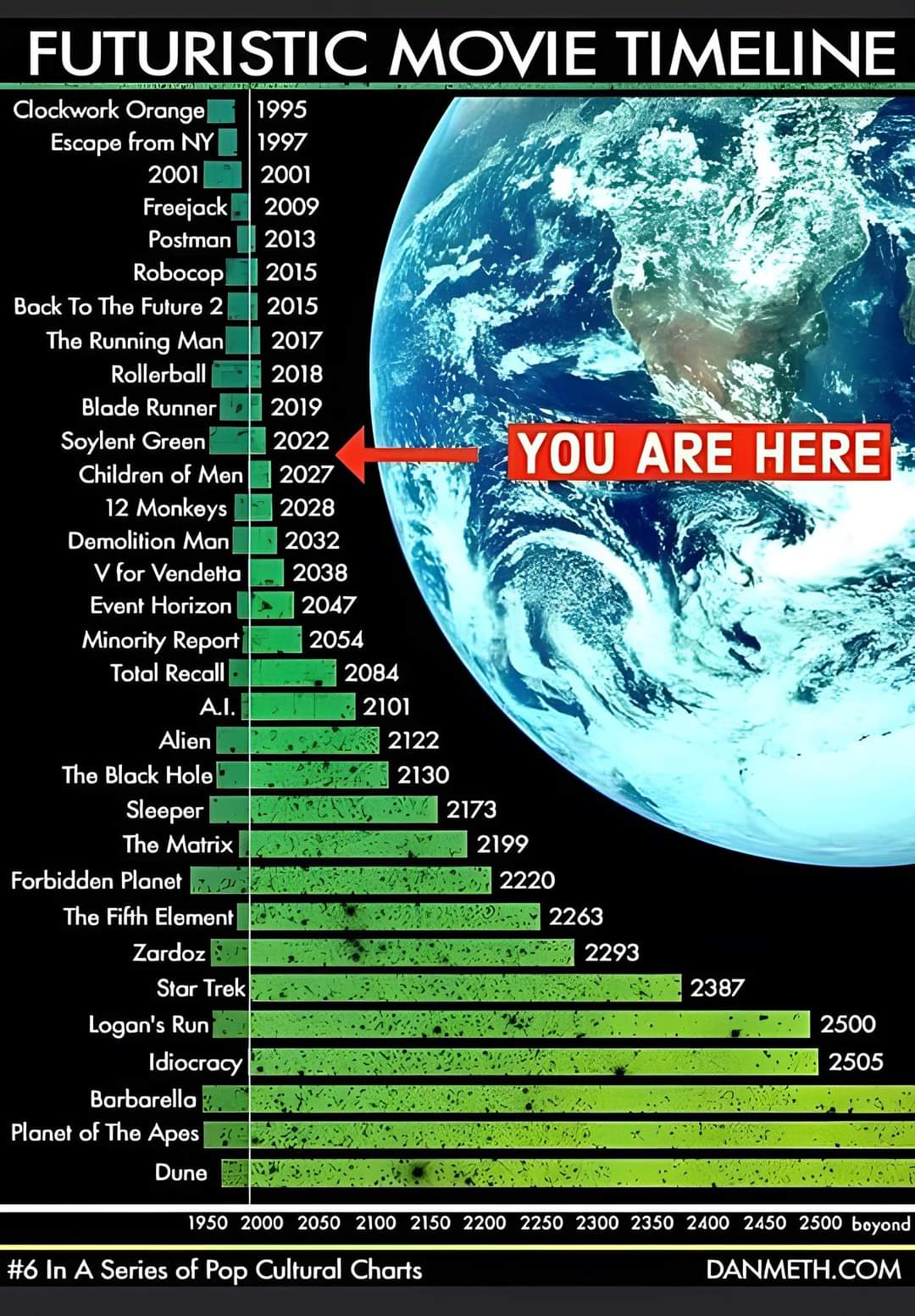
Future dates of movies in a timeline
This timeline of futuristic movies hilariously shows where we are in time. According to Hollywood, we should be eating Soylent...
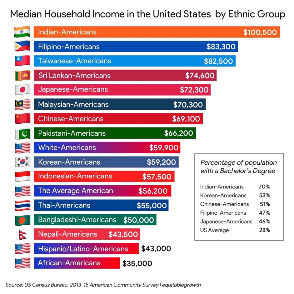
Want your kid to become a doctor, lawyer, engineer, or business owner?
Look at those charts: Indian-Americans top the income list, and engineering-heavy degrees dominate lifetime earnings. The signal? Structured, analytical thinking...
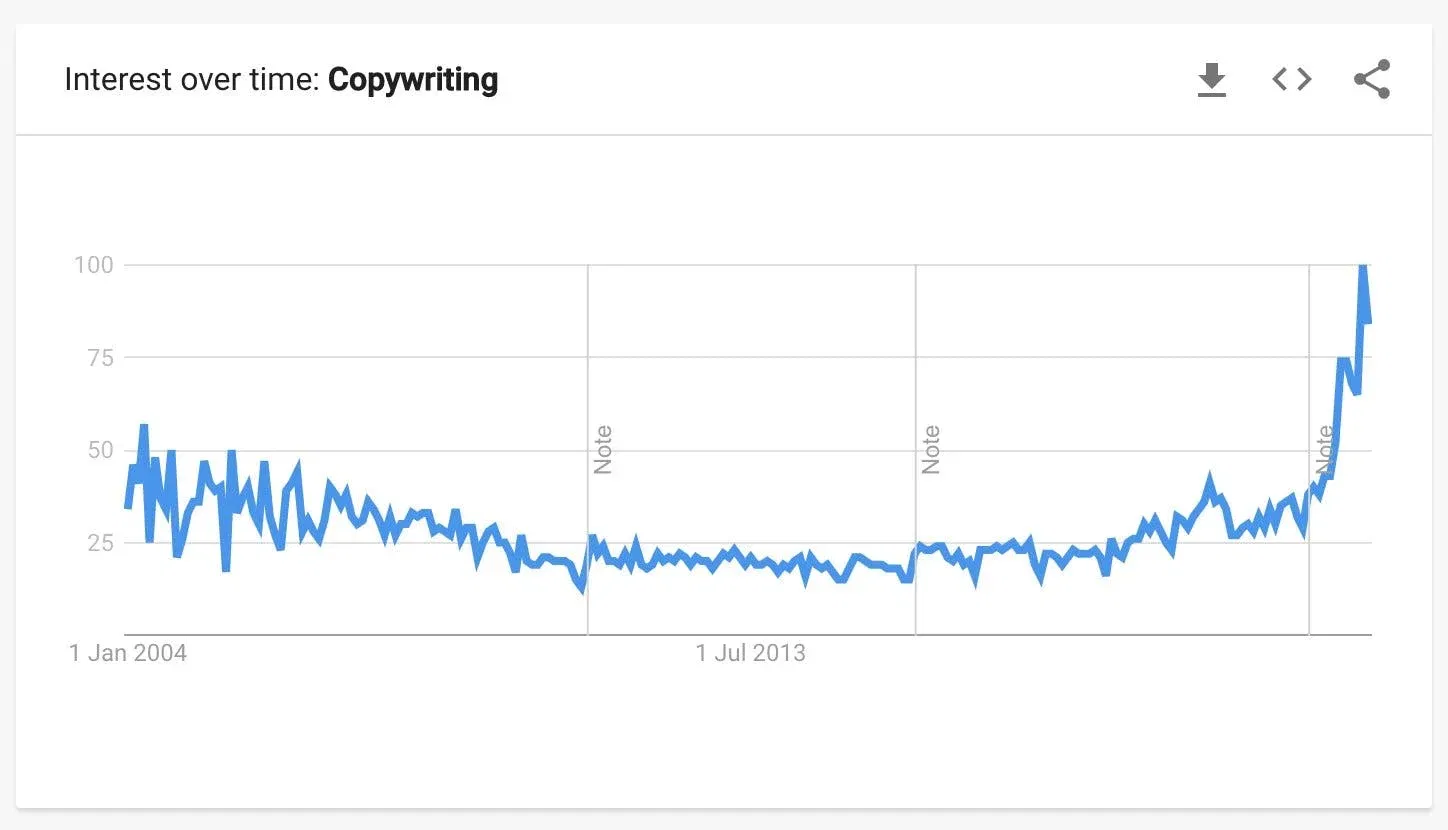
The keyword "Copywriting" from 2004 to now
This spike doesn’t lie. Interest in “copywriting” has shot through the roof since 2022. So what happened? The Marketing Analysis...

Visual demonstration of 400 calories of different foods
This image nails it. With just three stomachs, it shows how the same 400 calories can make you feel completely...

Age Appropriate Chores List
This “Age-Appropriate Chores” chart is secretly a masterclass in marketing. It takes one universal job—teaching kids responsibility—and breaks it into...
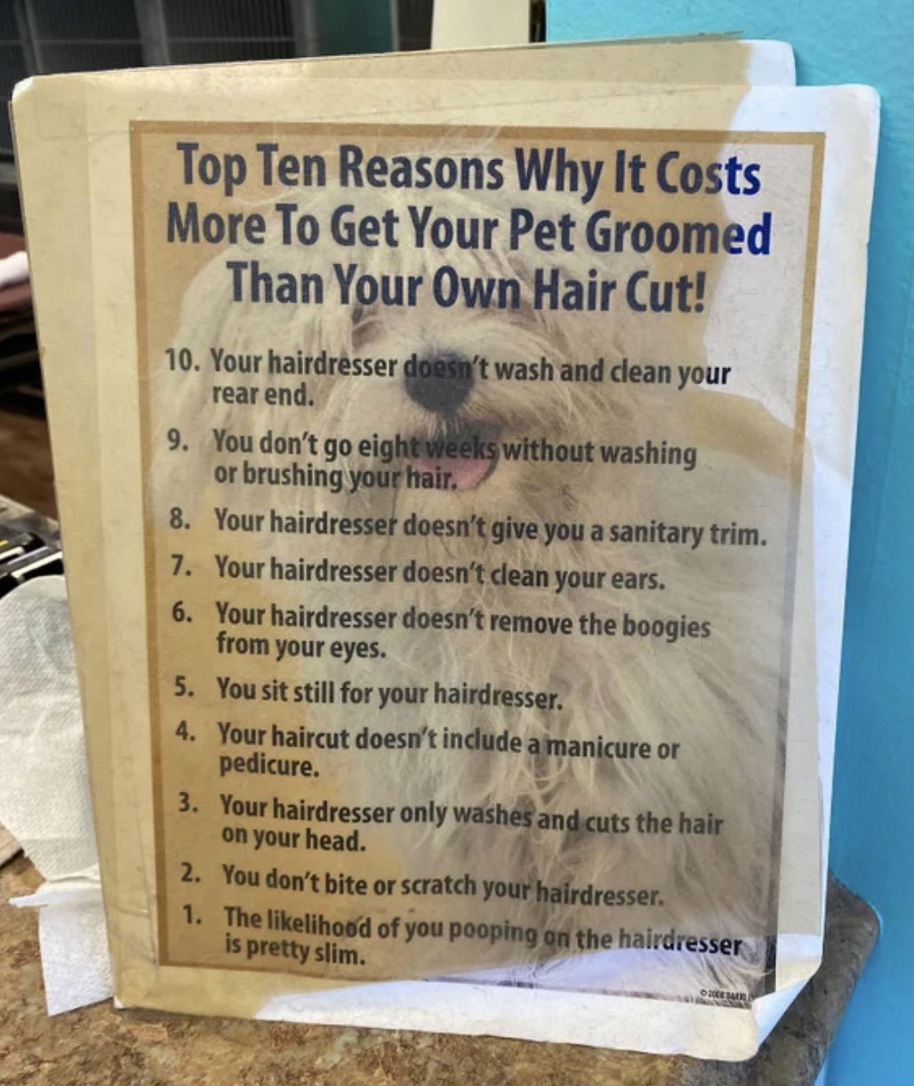
Dog Groomer Price Justification Chart
Every service provider faces the “Why are you so expensive?” question. This dog groomer found a hilarious and brilliant way...

Richest billionaire in each state chart
This chart nails one thing perfectly: turning piles of raw data into an instantly clear visual. A simple U.S. map...
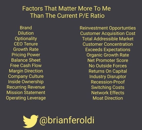
Text-length styled PE ratio chart
Big block paragraphs? Snooze fest. But a clean, balanced list that looks great? Instant scroll-stopper. Brian Feroldi nails this: his...
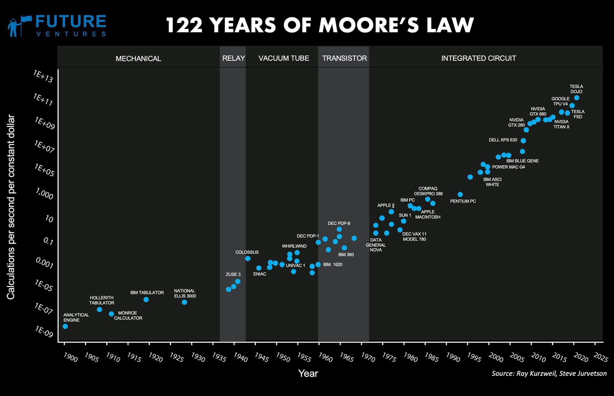
Moore's Law Data Plot
This chart shows something wild — computing power per dollar has skyrocketed for more than a century. Each leap (from...
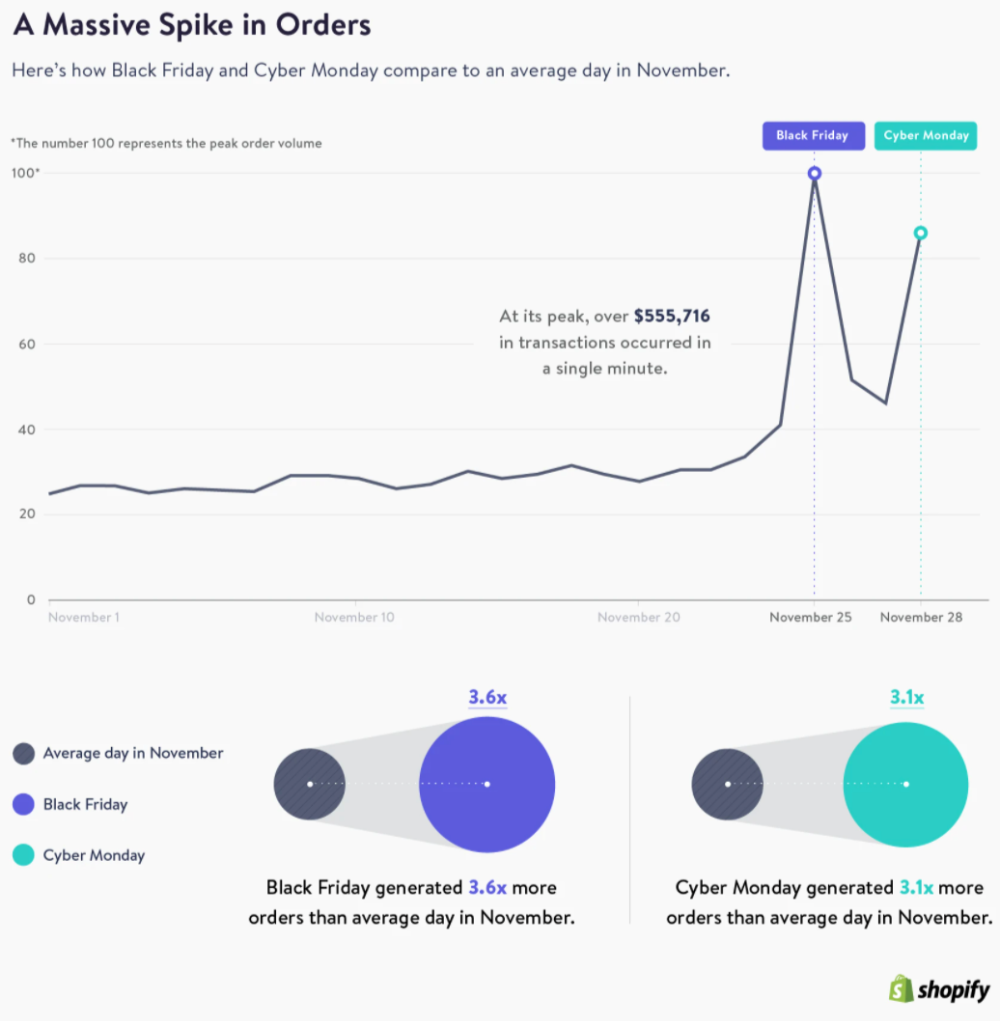
Black Friday + Cyber Monday Sales Graph
This Shopify chart tells a wild story. On regular November days, sales are steady… then Black Friday hits and order...

Black Friday Website Traffic Trends (Mobile vs Desktop)
Black Friday shoppers love their phones. This Bloomreach chart shows mobile leading the traffic race by a mile. But here’s...

Percentage of Population on Faceebook (by Country)
This chart looks impressive, right? Nearly 70% of Americans use Facebook. But here’s the kicker: that also means 30% don’t....

Mobile Vs. Desktop Ad Spend Trends
The chart tells a simple story: mobile is where the eyeballs (and dollars) are. In 2018, desktop ruled with 56%...

Advertising Forecast for 2021
This chart tells the story of a marketing world flipped on its head. By 2021, over half of all ad...

Social Network Active Users Comparison
This chart says a lot in one glance. Facebook doesn’t just run one big platform; it owns the entire social...

Ecommerce Growing Share of Total Q4 Sales
Every year, ecommerce eats a bigger slice of the Q4 sales pie. This chart shows it climbing from just 4.6%...