Apple's Revenue Graph
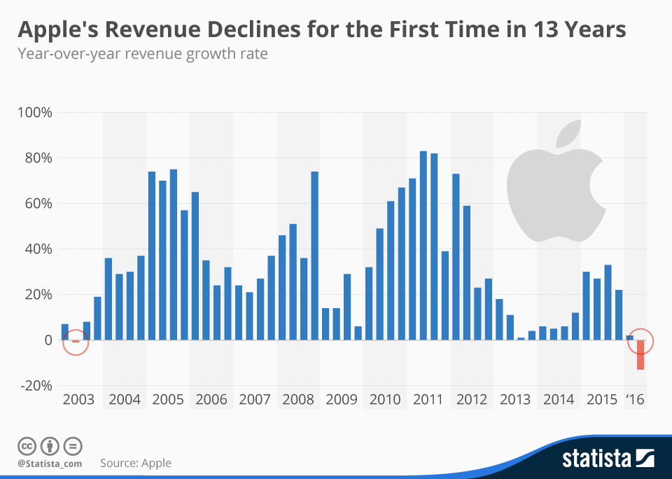
This chart hits you with a story in one glance: Apple’s revenue climbing hard for 13 years, then bam—a dip in 2016. Even juggernauts hit a wall when momentum fades.
Marketing Analysis
Apple’s explosive run came from fresh hits like the iPod, iPhone, and iPad. Each new product rebooted their growth curve. The decline shows what happens when innovation slows before the next big act lands.
Why It Works
- The visual makes growth tangible—success feels real.
- Shows how momentum compounds, then stalls.
- Reminder: loyalty follows innovation, not nostalgia.
Real-Life Examples
- Netflix jumped from DVDs to streaming before the curve flattened.
- Adobe swapped one-time sales for subscriptions, revenue skyrocketed.
- Nike keeps remixing hits like Flyknit and Air Max, staying in the spotlight.
Analyzed by Swipebot
Loading analysis...
