Apple's Revenue Graph
Before and After
Aug 30, 2017
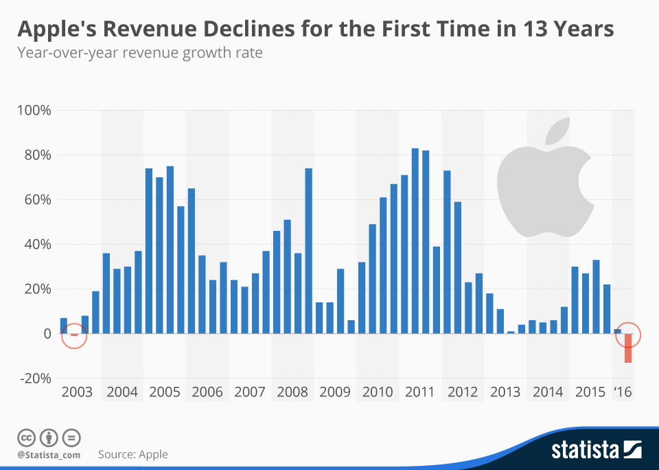
This graph was used to illustrate Apple's revenue decline after a 13-year streak.


This was a cool graphic showing Tropicana’s sales went DOWN after swapping their iconic orange-with-a-straw image for a plain glass...

There are few products that look so vastly different than previous generations.
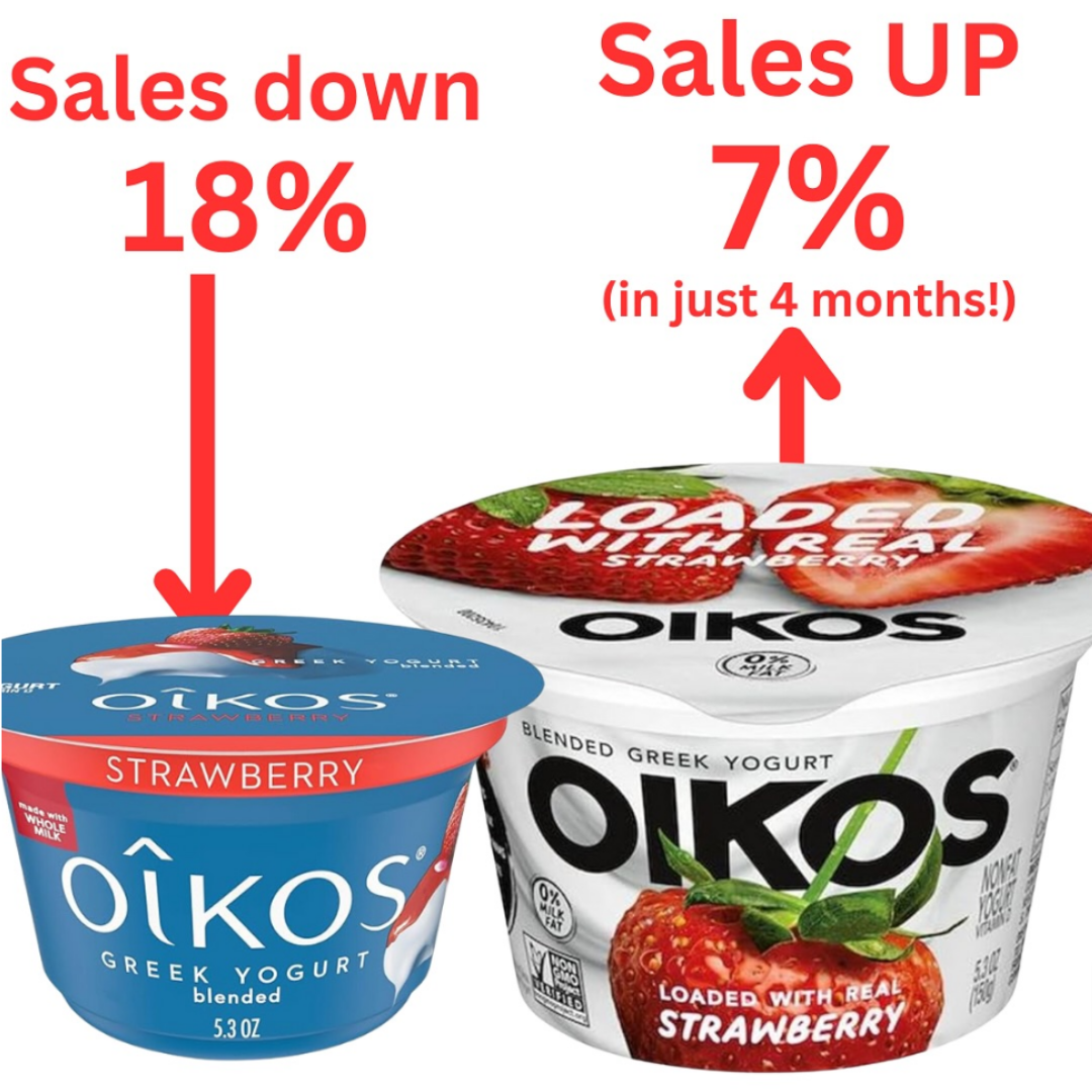
This was a slight packaging change, showcasing the contents as real strawberry rather than bland blue packaging. Sales increased by...
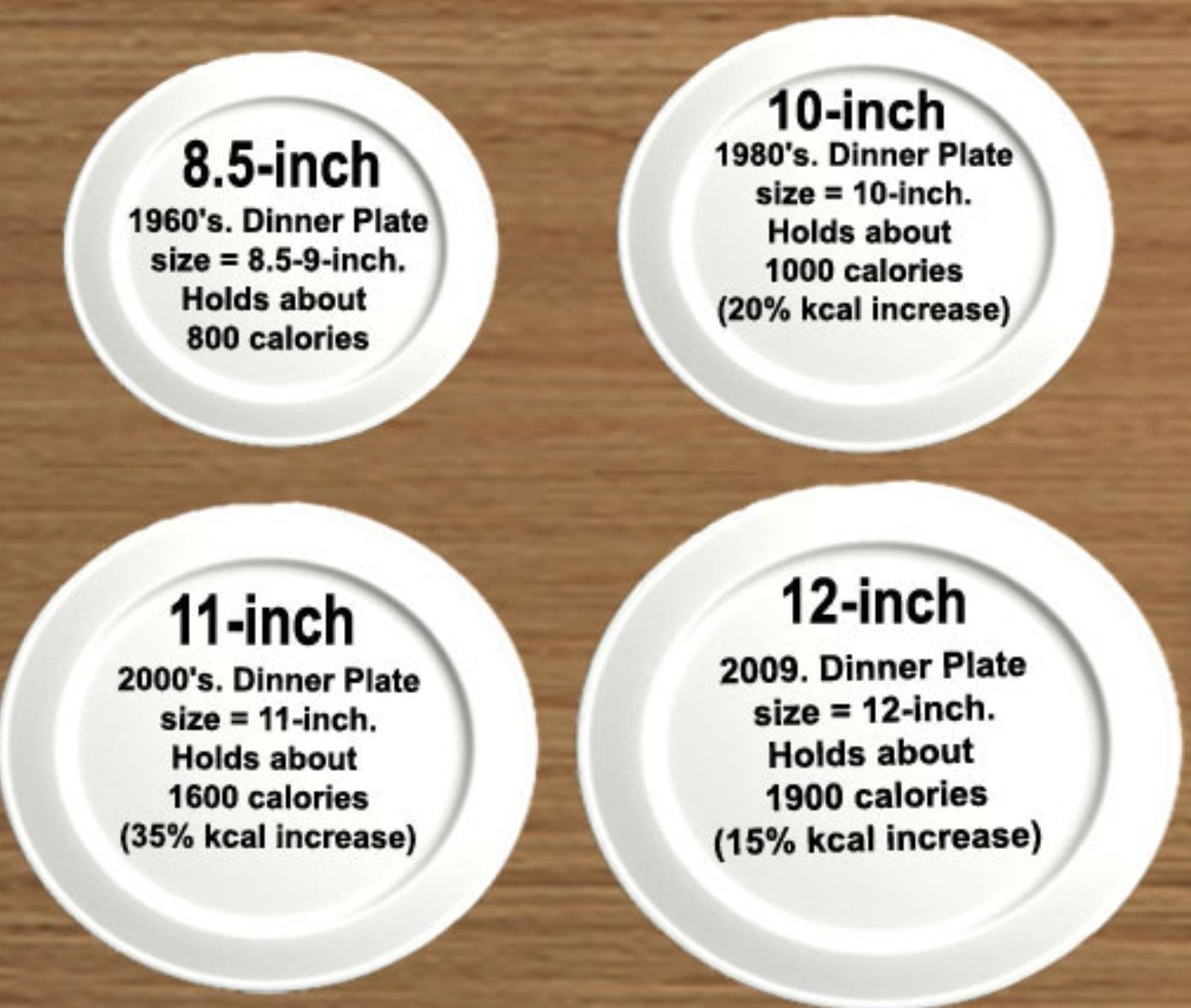
Since the 1960s, dinner plates have gotten way bigger — and so have our portions. This powerful image shows how...
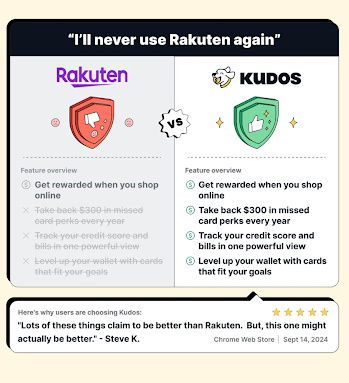
A bold comparison ad calling out Rakuten and positioning Kudos as the smarter choice.

I love a good comparison table, and this ad from AppSumo is a great example of it!The main selling point...
Search for a command to run...
This was a cool graphic showing Tropicana’s sales went DOWN after swapping their iconic orange-with-a-straw image for a plain glass...
There are few products that look so vastly different than previous generations.
This was a slight packaging change, showcasing the contents as real strawberry rather than bland blue packaging. Sales increased by...
Since the 1960s, dinner plates have gotten way bigger — and so have our portions. This powerful image shows how...
A bold comparison ad calling out Rakuten and positioning Kudos as the smarter choice.
I love a good comparison table, and this ad from AppSumo is a great example of it!The main selling point...
Search for a command to run...