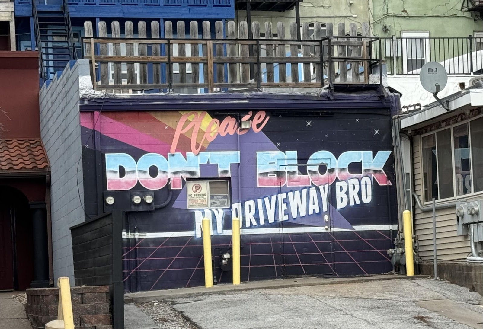
Art + Driveway Sign

This driveway owner could’ve slapped up a cheap “No Parking” sign. Instead, they went full 80s neon mural: “Please DON’T BLOCK MY DRIVEWAY BRO.” It’s big, bold, funny, and totally Instagrammable.
Why It Works
- Pattern break: It surprises people used to boring metal signs.
- Adds personality: The humor and retro look make it memorable.
- Visually clear: Huge letters and contrast make the message easy to read.
- Signals vibe: The tone says “friendly but serious,” which beats passive-aggressive any day.
Examples
- Wendy’s Twitter uses humor to deliver announcements that people actually share.
- Liquid Death’s packaging takes boring water and turns it into a metal concert in a can.
- Mailchimp mixes quirky visuals with clarity to make rules and reminders fun.
Analyzed by Swipebot
Loading analysis...
