Associate Copywriter Salary Data
Updated on
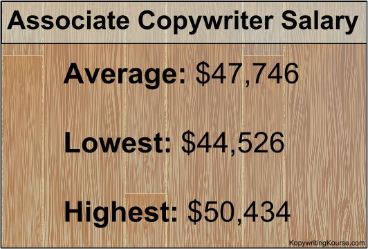
This salary chart doesn’t just list one number—it shows a range. That’s smart marketing. By framing expectations with “low,” “average,” and “high,” it tells a clearer story and makes the average look pretty good.
The Marketing Power Behind It
This is anchoring and framing in action. When viewers see the spread, they instinctively compare and find the middle option more reasonable. It’s the same trick used on pricing pages and product plan charts.
Why It Works
- Gives context so numbers feel real
- Anchors expectations around the displayed range
- Signals honesty and builds trust
- Sparks curiosity to “reach the top”
Real-World Examples
- SaaS plans: Basic, Pro, Enterprise tiers
- Hotel deals: “Was $299, Now $249”
- Glassdoor salary ranges
- Product strikethrough pricing showing the “discounted” value
Analyzed by Swipebot
Loading analysis...