Miller Lite Flat Design Magazine Ad
Updated on
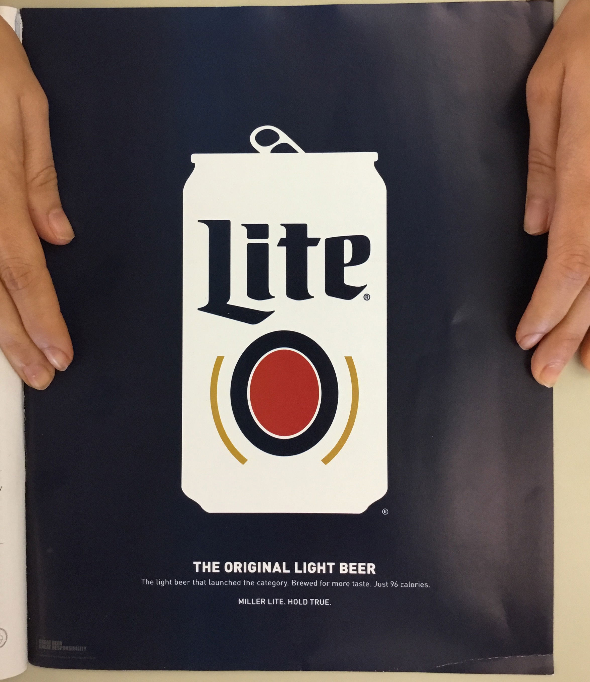
Flat can. Dark background. One tagline. That’s all Miller Lite needed to grab your attention. The ad looks almost too simple—until you realize that’s why it works.
How It Grabs You
Your eyes go straight to the can, then glide down to the tagline: “The Original Light Beer.” The design literally guides your attention in the right order, no clutter or confusion.
Why It Works
- Bold contrast pulls focus instantly
- Flat design beats overdesigned chaos
- Clear visual path controls reading flow
- One can, one line, one idea
Other Brands Winning with Simplicity
- Apple’s product pages: white space and clarity
- Dropbox: minimal visuals explain complex tech
- Spotify: bold colors + flat art that pop on any screen
Analyzed by Swipebot
Loading analysis...
