Kleenex Kube Vintage Print Ad
Updated on
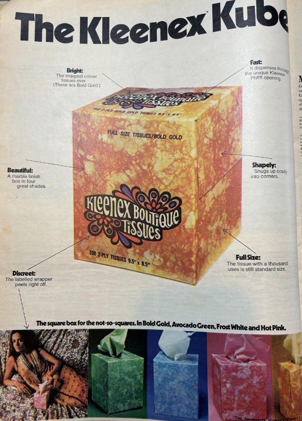
This vintage ad nails visual storytelling with a single cube of tissues. Kleenex didn’t just change the shape—they created a story around why that shape mattered. Every word on the page turns a simple tissue box into a stylish home accessory.
Marketing analysis
The copy points literally map out benefits on the box itself. Each feature (Bright, Shapely, Beautiful) connects a design element to an emotional or functional payoff. The product shot dominates the page, highlighting the “cube” as both innovation and fashion.
Why it works
- Turns a basic product into a design statement
- Uses visual hierarchy to guide attention
- Lists benefits that match real use cases (fit, access, aesthetics)
- Makes the mundane feel premium
Examples
- Apple’s Mac Cube: design over specs, and people bought it
- Method soap bottles turned cleaning into decor
- LaCroix cans branded seltzer water as stylish and fun
Analyzed by Swipebot
Loading analysis...
