Buffer Home Page
Updated on
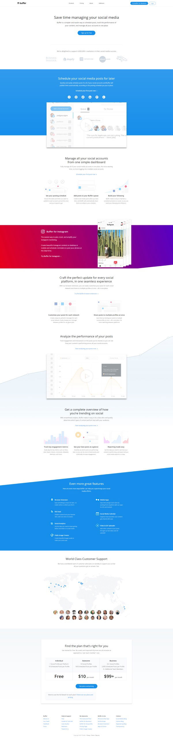
Ever land on a page and instantly know where to look? That’s not luck. That’s Buffer’s homepage design doing its job. Even before you scroll, your eyes jump from the headline to the bright blue call-to-action. Perfect attention control in action.
The Marketing Magic at Work
Buffer’s layout uses color, spacing, and contrast to steer your eyes exactly where it wants them. Heatmaps show most visitors follow the same visual path — headline, CTA, and then product visuals.
Why It Works
- Single, benefit-led headline grabs attention fast
- One CTA button keeps decisions easy
- White space creates focus and calm
- Bright color blocks guide your visual journey
- Scannable sections keep you scrolling down
Other Smart Examples
- Dropbox: Simple headline + single signup = clarity
- Slack: “Make work life simpler” nails benefit clarity
- Basecamp: Red button on white background = instant focus
Analyzed by Swipebot
Loading analysis...
.png?width=3840&quality=80)