Contently Home Page
Updated on
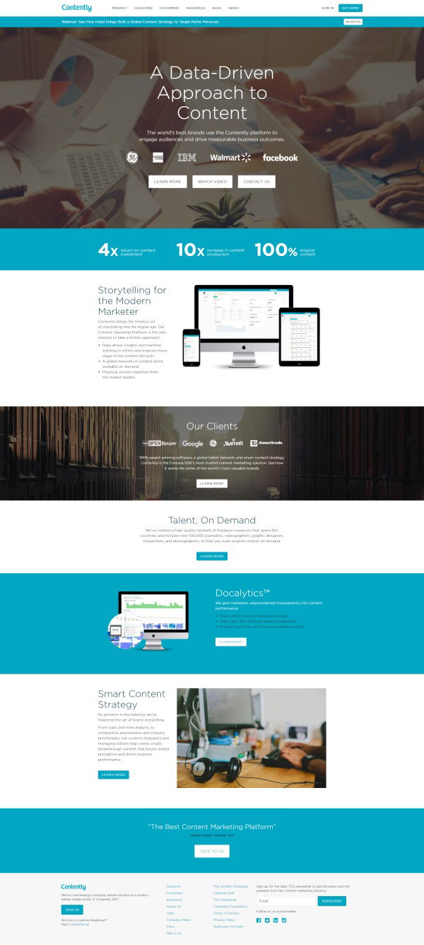
Look at Contently’s homepage and then check their heatmap study—boom, instant clarity on what actually grabs attention. The red-hot areas light up around the headline, client logos, and the three main CTAs. Everything else barely registers.
Marketing analysis
This heatmap proves that design isn’t about making things pretty—it’s about guiding eyeballs. Contently’s hero section uses a simple headline, trusted brand logos, and strong CTAs right where users look first. That’s smart layout science in action.
Why it works
- Visual grouping keeps users from getting lost
- Contrast buttons pull the eye faster than text
- Trust logos act as instant credibility anchors
- Clear, short headline sets the story fast
Examples
- Dropbox’s headline gets 80% of the gaze time
- Airbnb’s simpler CTAs lifted signups 30%
- Slack’s “Try for Free” button sits right in the visual hotspot
Analyzed by Swipebot
Loading analysis...
