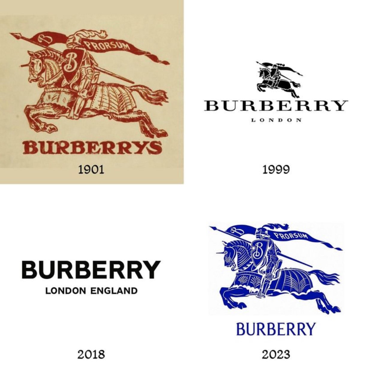
Burberry logo going from simple to complex design
Updated on

Over 120 years, Burberry’s logo tells a full story of design trends. It starts ornate, gets stripped down, and then swings back to something rich and detailed again. It’s like watching the whole design industry breathe in and out.
The Macro-Trend at Work
Logos (and brands) follow culture. When the world craves minimalism, simplicity wins. When nostalgia and “authentic heritage” feel valuable, complexity returns. Burberry just mirrors the zeitgeist.
Why It Works
- People associate simplicity with modern luxury.
- Complexity now communicates craftsmanship and legacy.
- The pendulum swing keeps the brand fresh while hinting at tradition.
- Nostalgia marketing taps deep emotional roots.
Other Brands That Did This
- Nike went flat for digital media, then layered textures in campaigns.
- Pepsi cycles between sleek futurism and retro nods.
- Instagram dropped skeuomorphism, then reintroduced gradients for depth.
- BMW simplified its logo for screen-friendly clarity.
Analyzed by Swipebot
Loading analysis...
