Huel "Pricey Takeout" Ad
Updated on
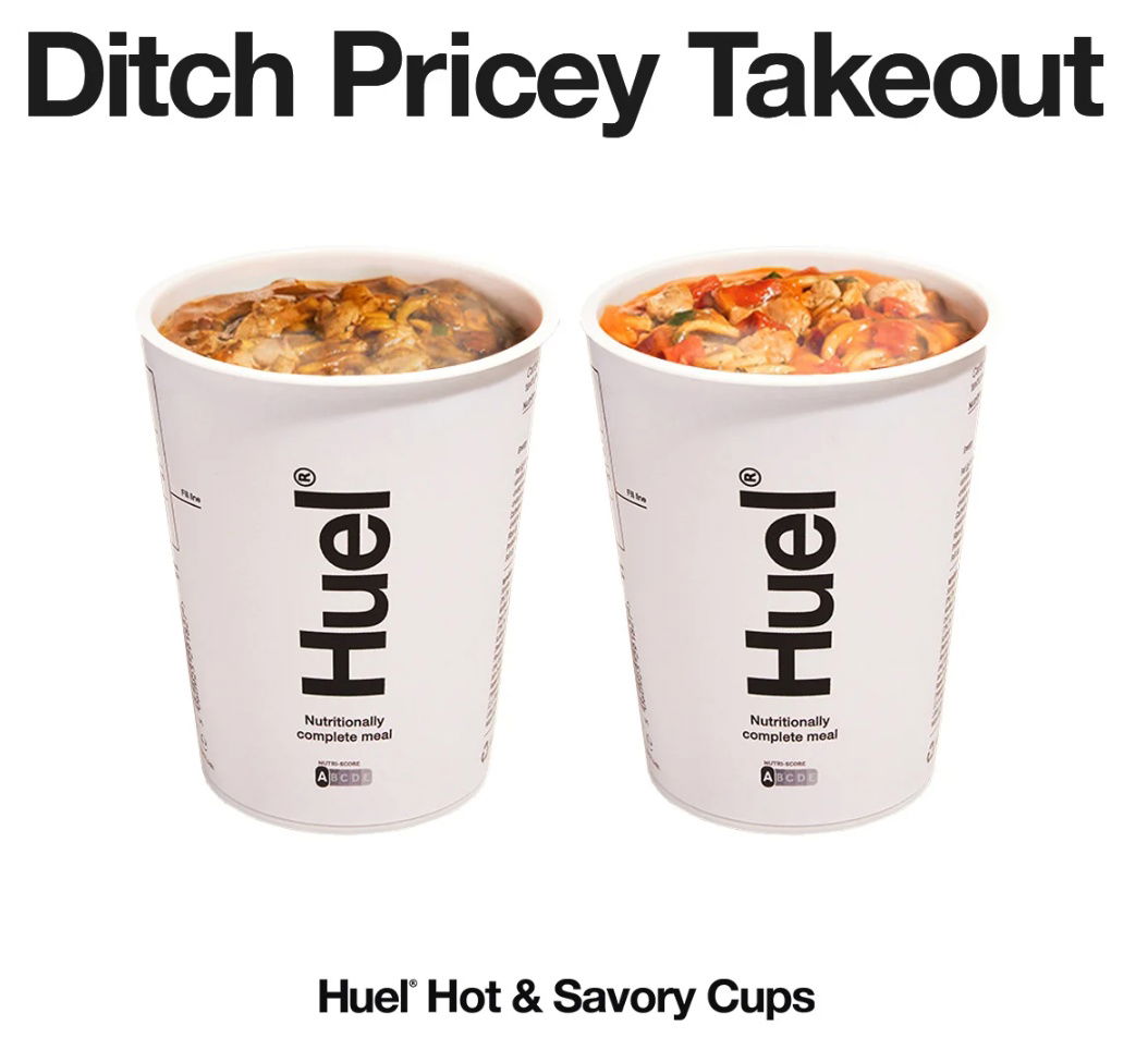
Huel’s “Ditch Pricey Takeout” ad is already a clean, modern hit. But remix it into a vintage 1980s style and suddenly it pops even more. This shows how a tiny tweak in design can totally flip how an ad feels.
Why this works
- Familiar headline: Short, direct, and speaks to the wallet.
- Clear visual: Two meals front and center—zero confusion on what’s being sold.
- Retro remix: Nostalgia grabs attention and makes it shareworthy.
- Single message: Save money, eat fast, feel good.
Examples of this idea in action
- Liquid Death uses vintage metal aesthetics to sell canned water.
- Burger King’s retro rebrand boosted their brand recall by 40%.
- Canva’s “Throwback Templates” surge in social engagement every time nostalgia hits.
Analyzed by Swipebot
Loading analysis...
