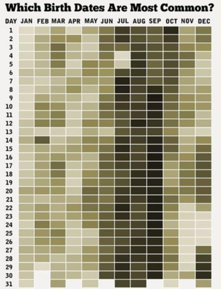
Ever looked at a data chart and thought, “ah, now THAT makes sense”? This birthday heatmap nails it. Just a simple grid, smart color shading, and your brain instantly spots the busiest birthday zones—no legend needed.
Why It Works
- Uses color contrast to show density, not overwhelm you with numbers
- Arranges info in a calendar-like layout your brain already recognizes
- Makes pattern recognition instant, not analytical
- Invites curiosity—people immediately start hunting for their own birthday
Real-World Examples
- Spotify’s Wrapped visuals turn listening data into colorful, intuitive stories
- The NY Times COVID trackers used gradients so readers could spot surges fast
- Fitness apps like Fitbit use daily streak heatmaps to show activity consistency
Good charts don’t just show data. They make you feel data.
Analyzed by Swipebot
Loading analysis...
