Copywriting Example - Blog Post

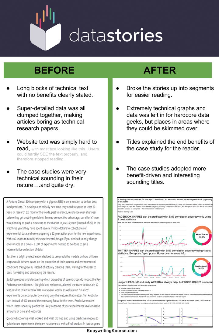
The “before and after” shot from Datastories is a masterclass in how formatting alone can turn a block of text into a binge-worthy read. Same info, new layout — and suddenly the brain actually wants to keep scrolling.
Marketing analysis
The right formatting is like giving your message a megaphone. Datastories’ “After” example adds white space, subheads, and visuals so data stops feeling like homework. Readers instantly know what’s important and where to focus.
Why it works
- Clear headlines act like road signs.
- White space creates breathing room.
- Short paragraphs keep attention moving.
- Charts give instant “aha” moments.
Examples
- Buffer’s clean charts make boring metrics go viral.
- HubSpot chops long guides with tons of subheads.
- Medium stories show visuals every few scrolls.
- Backlinko’s SEO posts feel like visual journeys.
- Ahrefs mixes graphs and stories to hold readers tight.
Analyzed by Swipebot
Loading analysis...
