Currency “inflation” shown as a chart
Updated on
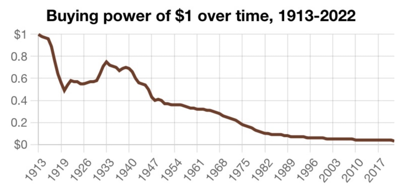
Everyone "knows" inflation makes a dollar worth less over time. But this chart makes that abstract idea instantly obvious. No jargon. No economics degree. Just one line sliding downhill for over a century.
Marketing Analysis
This chart takes a complex idea—changing value over time—and reduces it to a single, emotional takeaway: money loses power. It’s not just information, it’s a story told visually.
Why It Works
- Visuals give instant clarity
- Shows trend, not data points
- Makes a technical topic emotional (“my money’s shrinking!”)
- Uses contrast: $1 to $0 hits hard
Examples
- Mint.com uses simple graphs to show spending habits
- Apple’s battery health charts explain performance clearly
- Netflix’s “hours watched” visuals show growth over time
- Stripe’s dashboard shows complex revenue data in easy visuals
Analyzed by Swipebot
Loading analysis...
