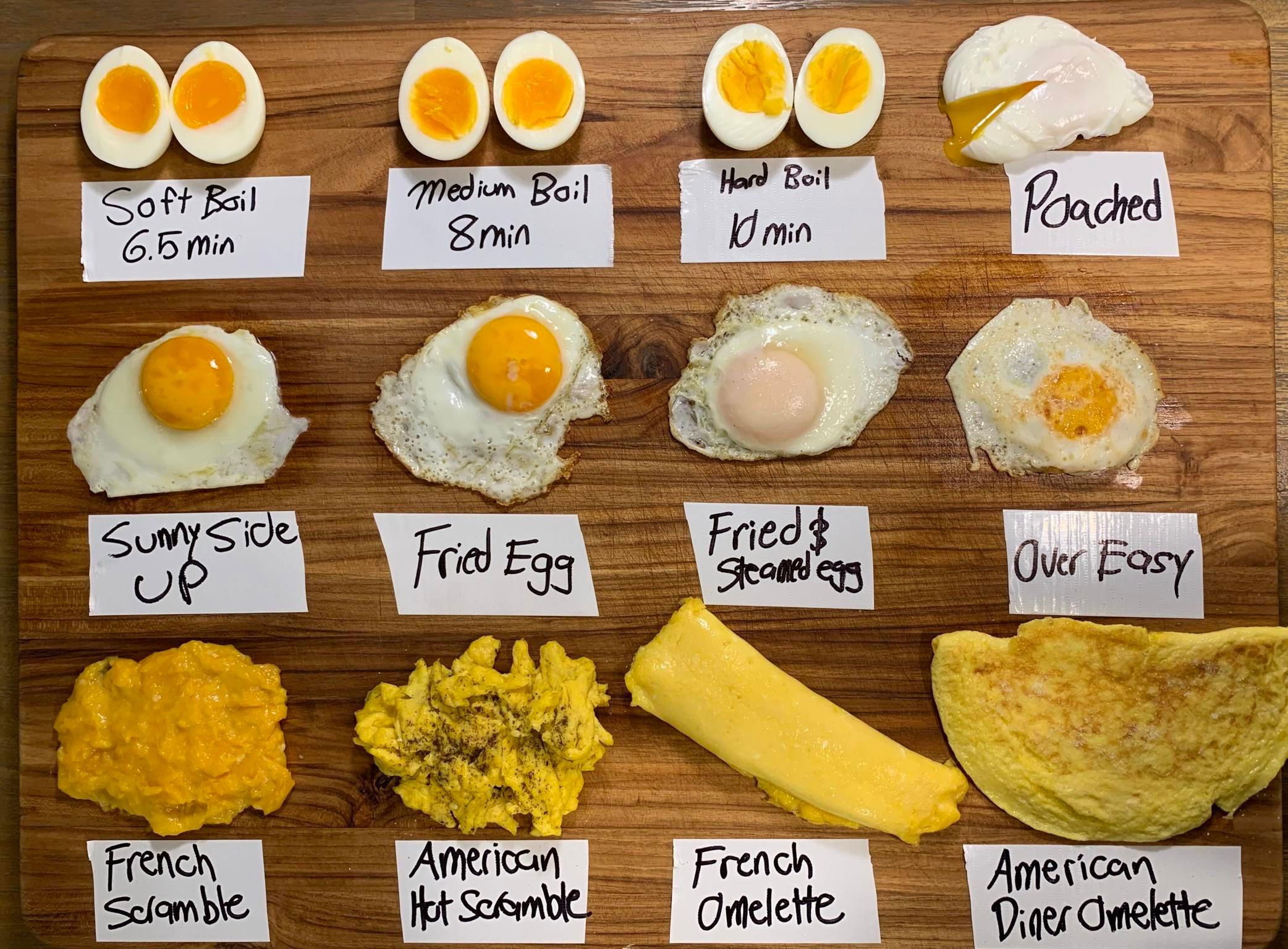
This egg chart is pure marketing genius. It shows twelve ways to cook an egg in one glance. No long explanations. No chef-level jargon. Just visual clarity that anyone can “get” instantly.
The Marketing Lesson
When your product or idea is complex, show it—don’t say it. A clear visual comparison like this turns confusion into understanding in seconds.
Why It Works
- Visuals beat paragraphs for clarity and retention
- Side-by-side comparisons make differences obvious
- Labels create structure and help scanning
- Simplicity makes info shareable and memorable
Real-World Uses
- Slack used charts to explain pricing tiers—clear and fast
- Canva’s template previews sell design styles instantly
- Tesla’s range comparison charts simplify tech specs
- Apple’s product lineup visuals make upgrades easy to see
Analyzed by Swipebot
Loading analysis...
