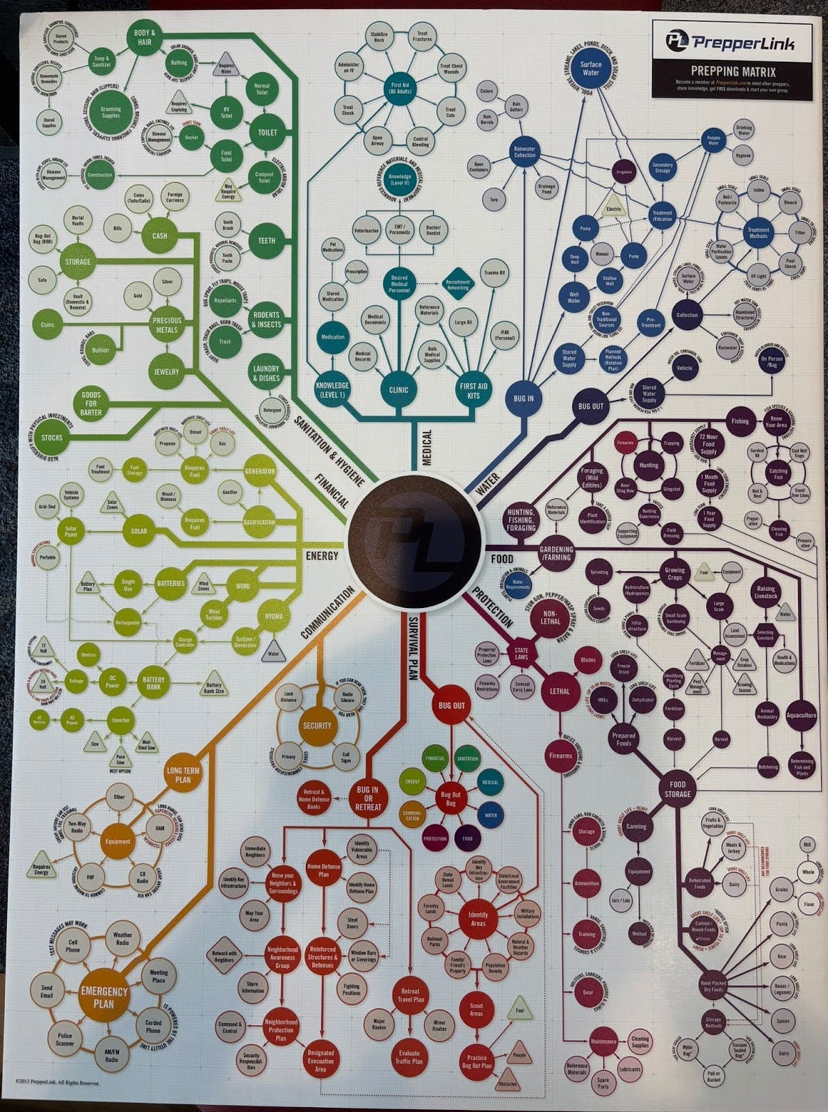
This “Prepping Matrix” looks like something out of a survivalist’s dream. But it’s also a killer metaphor for marketing planning. Every dot connects to another, showing how one weak point (like missing water storage) can break the chain. Marketers face the same problem when one missing channel or message weakens the whole funnel.
Why It Works
- Breaks down a massive, complex goal into bite-sized tasks
- Visualizes dependencies so nothing gets missed
- Encourages long-term thinking and scenario planning
- Makes overwhelming ideas feel manageable
Examples
- HubSpot’s flywheel map replaced the funnel to visualize growth loops
- Amazon’s “Working Backwards” doc starts from the outcome and connects every part of the process
- Airbnb’s customer journey map reveals every touchpoint from first search to post-stay review
- Asana’s marketing roadmap template links goals to deliverables in one glance
Analyzed by Swipebot
Loading analysis...
