Figma.com Home Page
Updated on
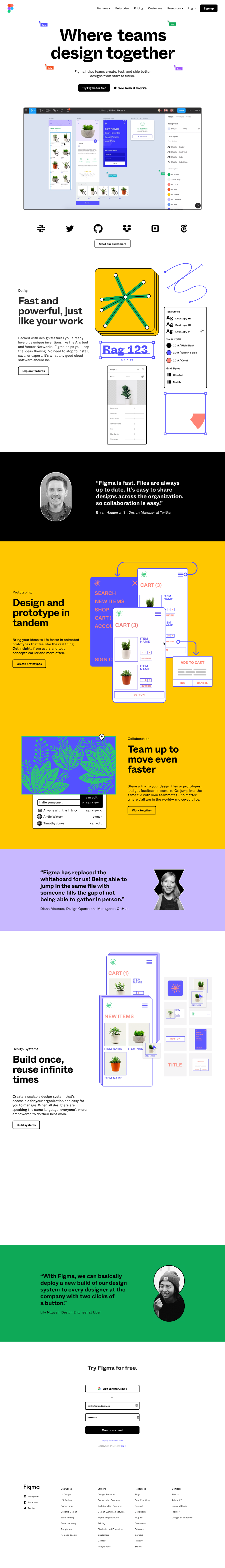
Figma absolutely nails its homepage. They don’t just talk about collaboration—they show it. The entire page feels like a live demo of their tool in action, loaded with video loops, screenshots, and social proof that screams “real teams use this.”
Marketing analysis
Visual storytelling drives the whole experience. Each scroll reveals a small, colorful proof point: animated features, familiar brand logos, and customer quotes. It’s an interactive sales pitch disguised as a product tour.
Why it works
- Shows, doesn’t tell—every claim is backed by motion or visuals.
- Social proof builds instant trust (Slack, Spotify, Zoom logos).
- CTAs are low-risk (“Try for free” keeps the barrier low).
- Benefits are tangible: faster design, smoother teamwork, fewer bottlenecks.
Examples
- Notion’s homepage also walks users through the tool with looping demos.
- Canva’s landing pages use GIFs to show off editing features.
- Miro displays real-time collaboration boards right on their homepage.
Analyzed by Swipebot
Loading analysis...
