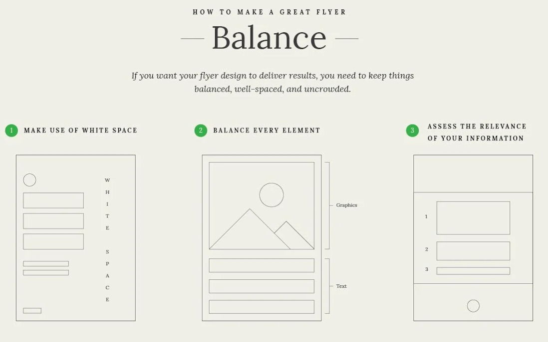
Flyer Design Elements wireframes.

Ever pick up a flyer that feels heavy and crowded? Yeah, no one reads those. This guide nails the golden rule of design: balance. Keep your layout light, clean, and to the point.
Why this visual works
The image breaks flyer design down into three rules:
- Use white space so the eye can rest.
- Balance graphics and text evenly.
- Keep only the info that matters.
Why it works
- White space builds focus and sophistication.
- Balanced layouts improve readability.
- Relevant info creates faster decisions.
- Visual hierarchy directs attention naturally.
Real-world wins
- Apple ads: minimalist layouts that scream quality.
- Airbnb pages: clean images + concise copy.
- Eventbrite templates: top-down flow drives RSVPs.
- Spotify promos: bold visuals and minimal words keep users scrolling.
Analyzed by Swipebot
Loading analysis...
