Before and After of Chat with any PDF Sales Page
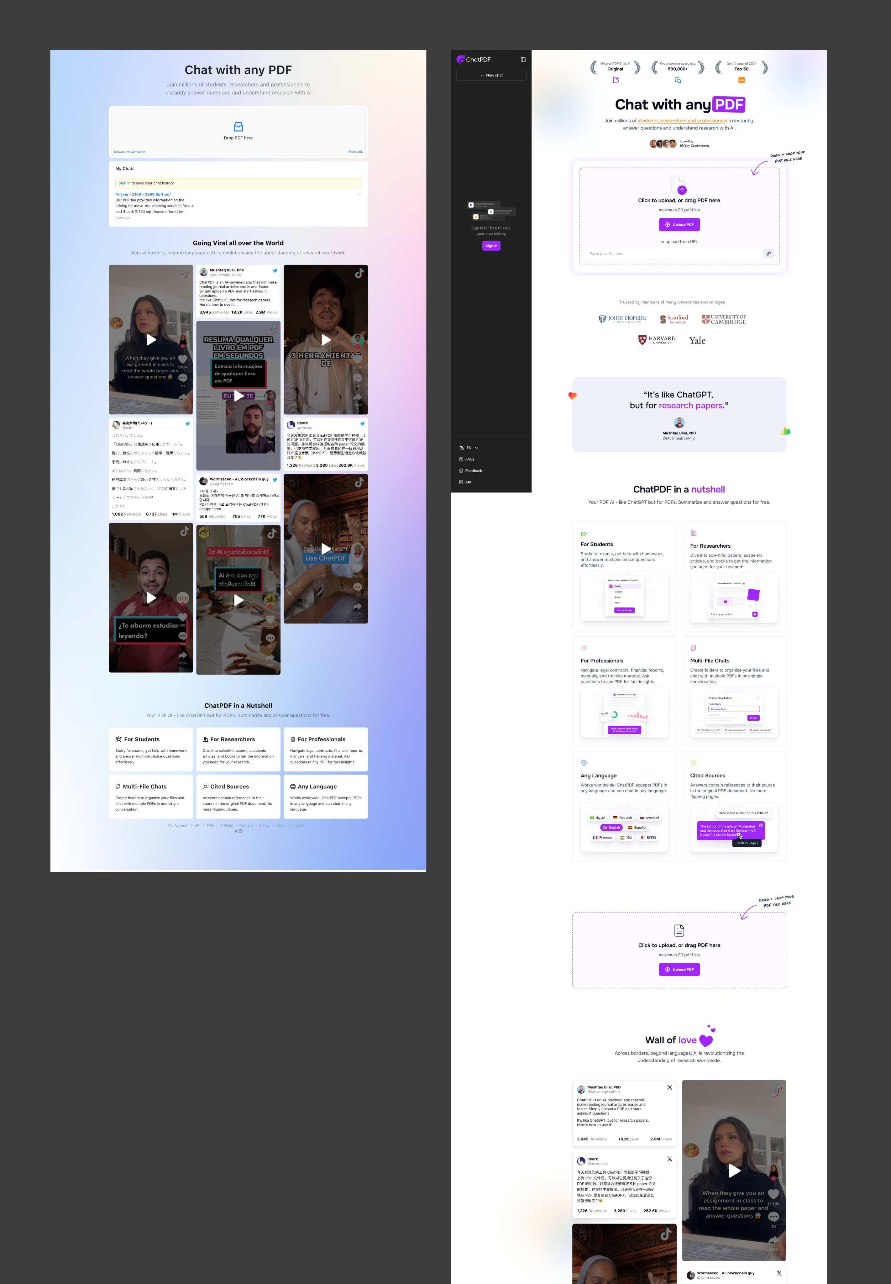
The new Chat with any PDF site nailed a subtle but powerful marketing principle: clarity converts. The redesign makes it instantly obvious what the product does and how to start using it.
Marketing Analysis
Everything above the fold explains the core action: upload a PDF, start chatting. The new layout uses white space, clear copy, and a straightforward flow that reduces cognitive friction—no guessing, no extra clicks.
Why It Works
- Simple, logical flow = faster “aha!” moment
- Minimal design focuses attention on one action
- Specific examples (“for students, researchers…”) create relevance
- Visuals show how it works instead of just telling
Examples
- Dropbox’s early homepage used a simple explainer video to boost conversions by 10%.
- Calendly’s homepage centers on one CTA: “Sign up for free.”
- Notion uses product GIFs to demonstrate exactly what users can do.
Analyzed by Swipebot
Loading analysis...
