Superads Before and After Graphs
Updated on
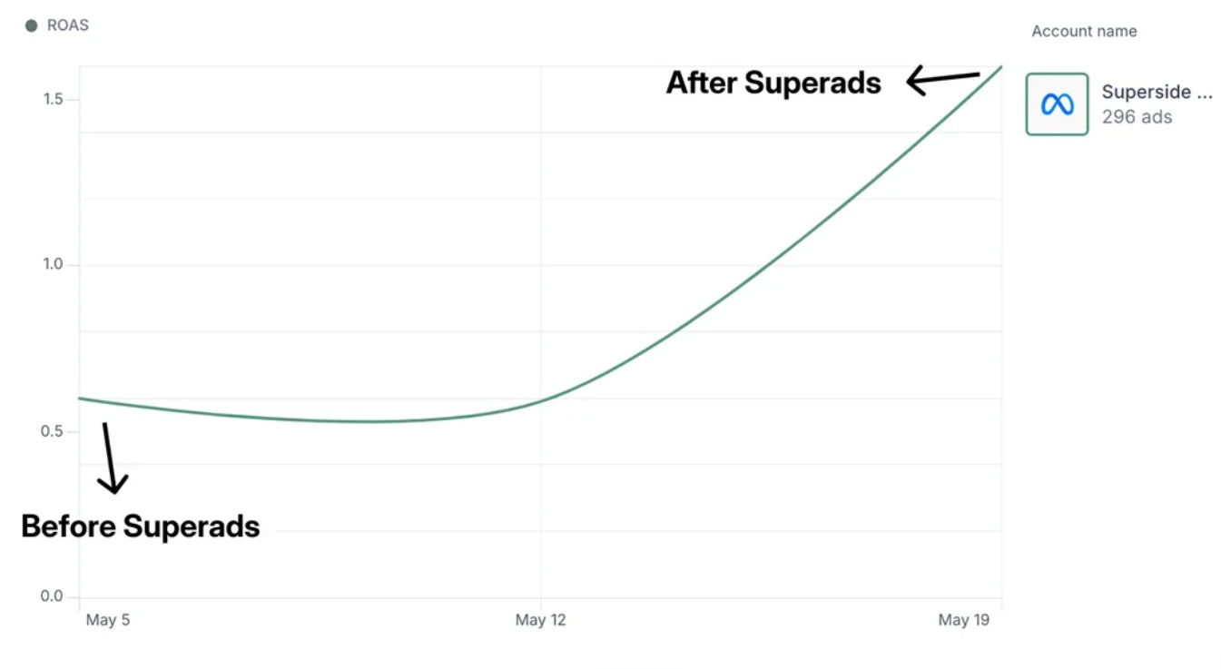
Nothing sells like a chart that climbs. This simple ROAS graph from Superads.ai shows a clean “before and after” story with a single line going up and to the right. No fancy slogans needed. The curve is the copy.
Why It Works
- Visual proof beats verbal claims
- Simplicity = instant trust
- The “before and after” format triggers curiosity
- Directional growth signals success at a glance
- Data-backed visuals make abstract results feel real
Real-World Examples
- Dropbox’s referral signup chart during case studies
- HubSpot showing lead growth after using their CRM
- Apple’s battery life graphs in product keynotes
- Facebook’s ad manager screenshots in testimonials
- ConversionXL showing uplift from A/B test results
Analyzed by Swipebot
Loading analysis...
