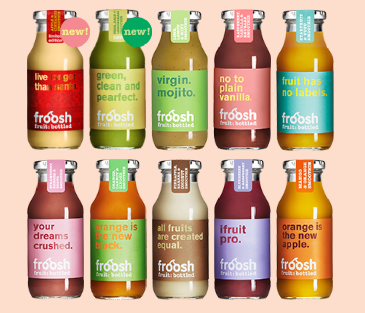
Froosh Bottle Packaging
Updated on

Froosh didn’t just sell juice. They sold smiles in bottles. Each one carries a tiny, clever slogan that doubles as a mini billboard. “Your dreams crushed.” “Green, clean and pearfect.” You can’t walk past without looking.
The Marketing Juice Behind It
These labels mix wit with product benefits. Every line screams fresh, natural, and fun. The jokes are quick to read and snap-worthy enough to share on social.
Why It Works
- Humor slices through boring packaging
- Copy ties straight to product benefits
- One-second-read format fits grocery scanning
- Shareable lines spread brand awareness
- Builds a cool, approachable personality
Examples
- Oatly: cartons full of self-aware copy
- Innocent Drinks: playful tone turned loyal
- Liquid Death: edgy humor transformed water into a movement
Analyzed by Swipebot
Loading analysis...
