Full Real Estate Listing On Postcard
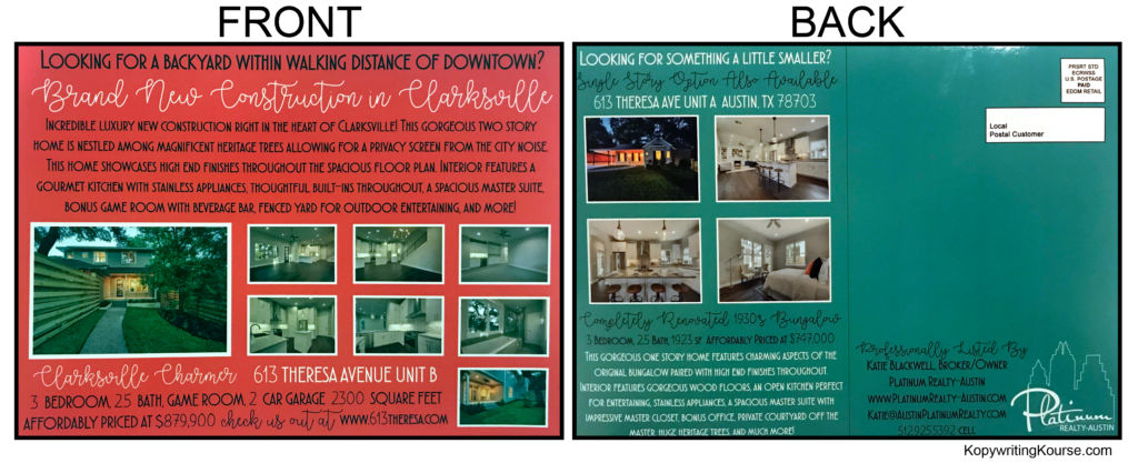
Ever seen a postcard stuffed with info that somehow still looks clean and grabs your attention? This real estate flyer does exactly that. Two listings, tons of text and photos, yet your eyes know exactly where to go first.
Marketing analysis
The heatmap shows it’s not luck — it’s smart design. The bright red headline sucks in the eye, the short bursts of text keep you reading, and the photo clusters feed your curiosity fast. The layout flows naturally from “what is it” to “how much” to “what it looks like.”
Why it works
- Bold colors guide attention like arrows
- Bite-sized text blocks make quick reading easy
- Multiple photo thumbnails build instant trust
- Clean design hierarchy keeps the viewer moving
- Every block adds value, not clutter
Examples
- Zillow’s image galleries lift clicks by 45%
- Airbnb cover shots make or break bookings
- Car dealers use color-coded “new” tags to boost excitement
- Bright real estate mailers triple recall rates over plain ones
Analyzed by Swipebot
Loading analysis...
