FYI Search Sales Page
Updated on
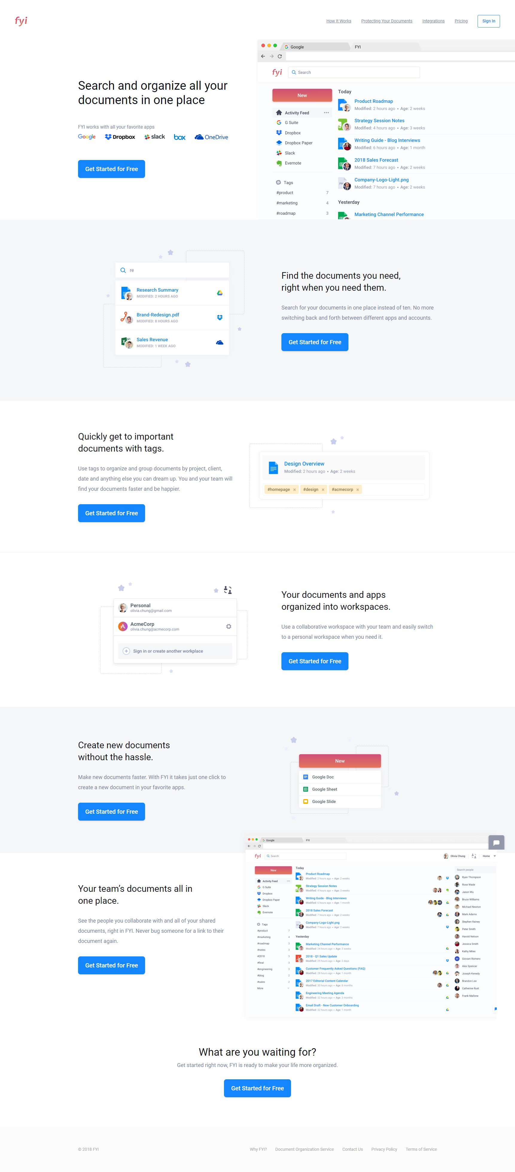
Some landing pages over-explain. Others under-explain. FYI’s page nails it perfectly. They use short sections, crisp headlines, and product visuals that walk you through the tool step by step—without ever feeling heavy.
Why It Works
- Every scroll section explains one clear benefit
- Each feature is “shown” with a clean screenshot, not just “told”
- The same CTA repeats after every concept (“Get Started for Free”)
- White space and hierarchy make it easy to skim
Examples
- Dropbox’s homepage guides visitors with visuals before asking for signup
- Notion’s landing pages show features in context rather than describing them
- Slack demos its UI step-by-step with short headlines and gifs
- Trello illustrates features with real boards instead of bullet points
Analyzed by Swipebot
Loading analysis...
