High converting landing page template (for apps)
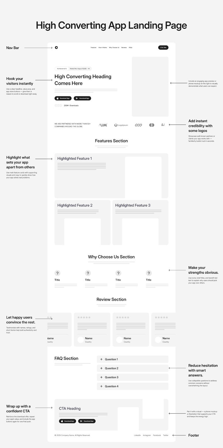
This wireframe is a masterclass in keeping things stupid simple. Every section leads users one clear step closer to clicking that “Download” button.
Marketing Analysis
The design follows classic conversion flow logic: hook attention, build trust, reduce doubt, and end with a confident call to action. It’s clean, visual, and psychology-backed—no fluff, all function.
Why It Works
- Clear headline + quick value prop = instant clarity
- Social proof (logos + reviews) builds trust fast
- FAQ reduces hesitation right before conversion
- Consistent CTAs keep focus on one goal
- Visual hierarchy makes scanning effortless
Examples
- Notion’s landing page shows “trusted by 20 million users” to boost credibility
- Airbnb features user testimonials to convert hesitant travelers
- Spotify uses a single CTA—“Get Spotify Free”—to remove decision friction
Analyzed by Swipebot
Loading analysis...
