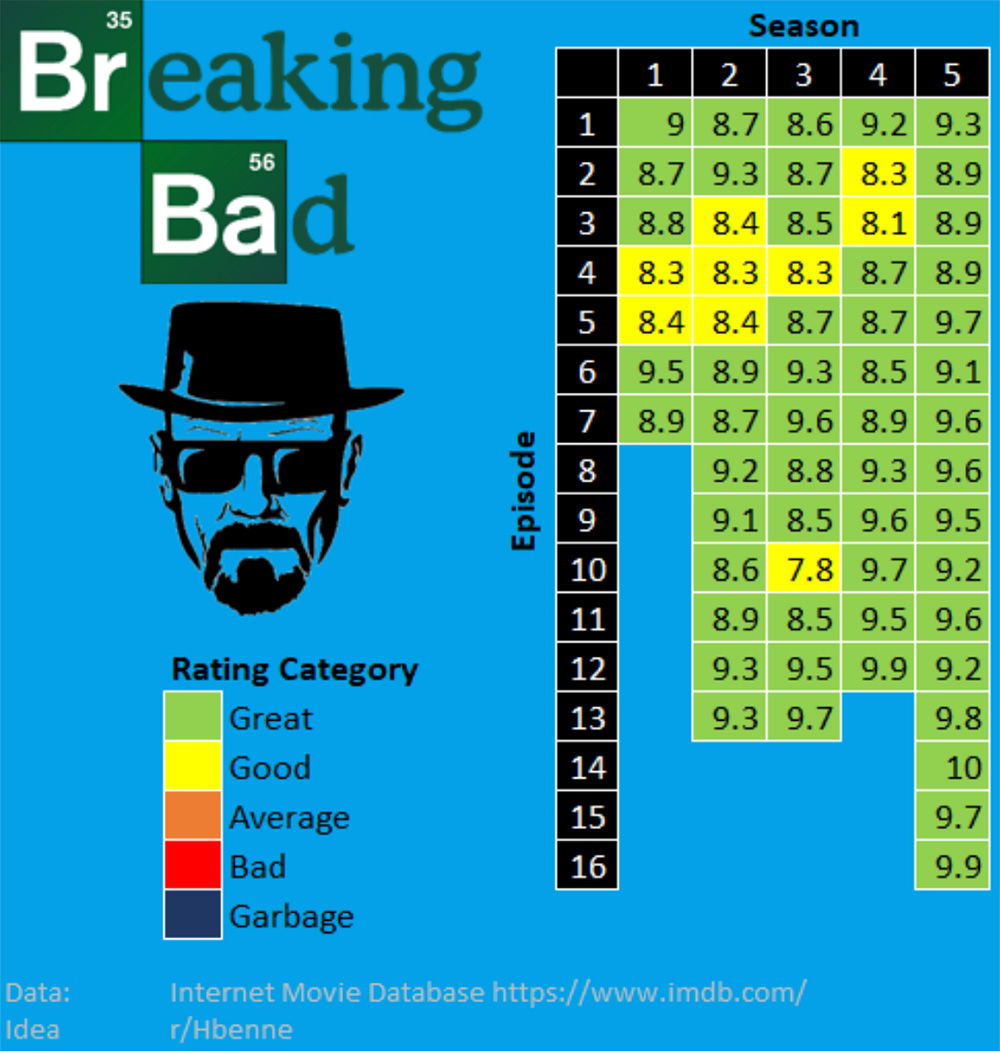
This chart nails what most dashboards get wrong: clarity. It takes five seasons, dozens of episodes, and turns that into one instantly readable visual story.
Marketing Analysis
Each colored box gives instant meaning. No explanation needed. Green = good, yellow = meh. It’s visual storytelling 101 — simple, intuitive, effective.
Why It Works
- Turns complex data into one-glance insights
- Color-coding makes interpretation brainless
- Consistent layout invites quick comparisons
- Strong branding ties it to the show’s identity
Examples
- Spotify Wrapped – complex user data turned into a shareable story
- Netflix’s “Most Popular” charts – color and layout make rankings easy
- HubSpot dashboards – clean data visuals encourage daily use
Analyzed by Swipebot
Loading analysis...
