Starter Story Academy checkout page
Updated on
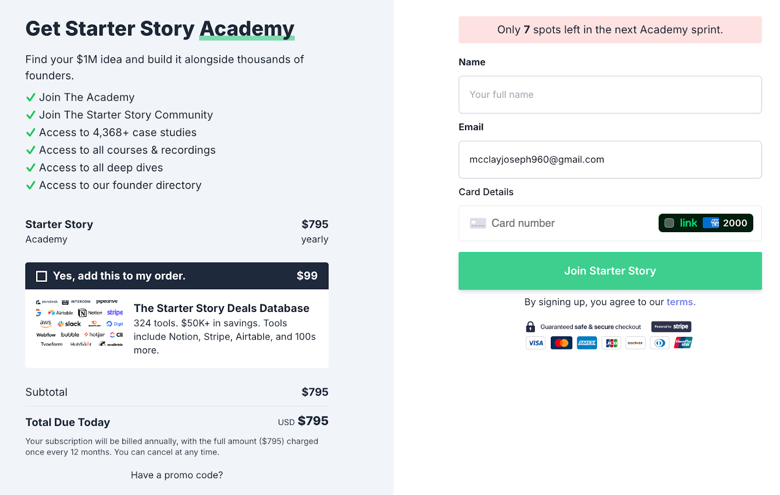
This Starter Story Academy checkout page nails the tricky mix of simplicity and persuasion. It’s clean, easy to follow, and uses urgency to push action.
Smart Checkout Design
- The left side sells the dream: access, community, and exclusive content.
- The right side keeps things friction-free: simple fields, secure checkout, and a green “Join” button.
- That pink banner saying “Only 7 spots left” triggers scarcity and drives immediate action.
Why It Works
- Uses FOMO to motivate quick decisions
- Visual hierarchy guides your eye from value to payment
- Minimal form fields reduce drop-off
- Optional upsell feels helpful, not pushy
Real-World Examples
- Airbnb shows “only 2 listings left” to increase bookings
- AppSumo highlights limited-time offers for faster conversions
- MasterClass uses countdown timers to drive enrollment spikes
Analyzed by Swipebot
Loading analysis...
