Landing Page wireframe with callouts.
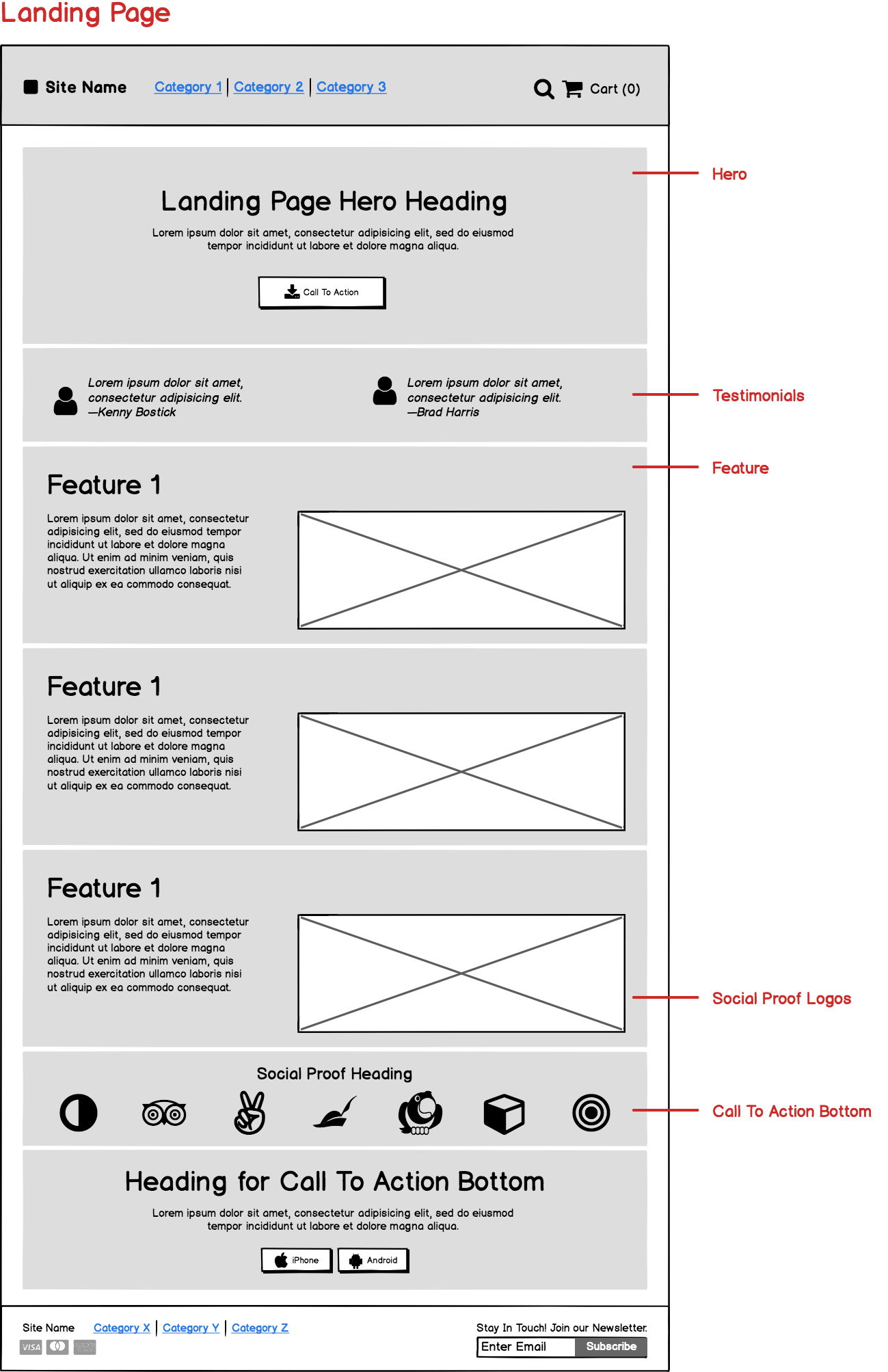
This wireframe nails the basics of a high-converting landing page. Every section has a clear purpose: grab attention, build trust, explain value, and drive action. Simple, clean, and designed to funnel visitors toward one goal.
Marketing Analysis
The page starts strong with a bold hero headline and a clear call-to-action. Then it stacks on testimonials for quick credibility, walks through benefits (not just features), and ends with another call-to-action. Repetition of CTAs ensures visitors never have to scroll far to act.
Why It Works
- Clear hierarchy: Each section pushes users one step closer to conversion.
- Social proof: Testimonials and logos build instant trust.
- Focused CTAs: Smart placements at top and bottom capture intent.
- Scannable layout: No clutter, no confusion—just flow.
Examples
- Dropbox simplified its sign-up page to one CTA and boosted conversions by 10%.
- Basecamp’s landing page features testimonials right after the hero.
- Airbnb uses brand logos and user stories to build immediate credibility.
- Slack keeps repeating CTAs to make sign-ups effortless.
Analyzed by Swipebot
Loading analysis...
