Landing Page Wireframe for Real Estate
Updated on
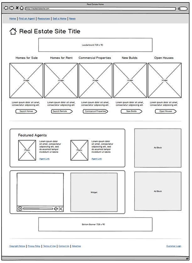
Most real estate sites bury the main thing people come for: the listings! This wireframe nails it by putting listings front and center, letting visitors start house-hunting instantly.
Why this layout works
- Shows listings right away—zero confusion on what the site does
- Reduces clicks to get users where they want to go
- Uses clear categories (For Sale, For Rent, etc.) to organize choice
- Visual layout feels like browsing, not searching
- Keeps agents and ads secondary but still visible
Real-world examples
- Zillow: Hero section starts with a giant search bar and listings immediately below
- Realtor.com: Prioritizes search results over content blocks
- Redfin: Displays active listings with thumbnails and prices up top
- Trulia: Groups listings neatly by property type to simplify selection
Analyzed by Swipebot
Loading analysis...
