MembershipGeeks Pricing Structure
Updated on
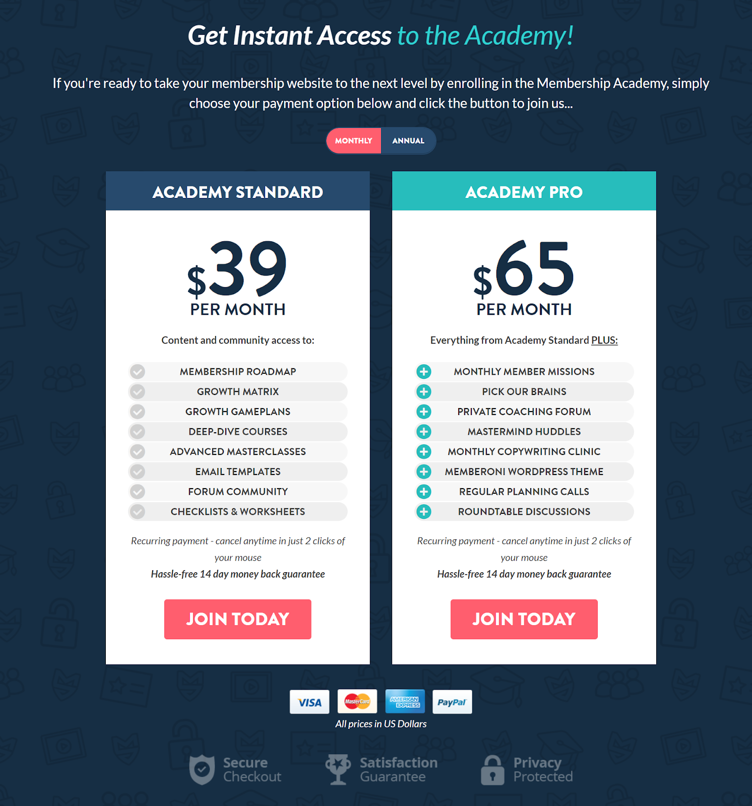
MembershipGeeks nails their pricing page. Two clear options. Clean layout. Each plan’s value spelled out like a restaurant menu.
Why This Design Works
- Side-by-side comparison: Makes it easy to see what you get with each plan.
- Anchoring effect: The higher-priced plan makes the standard one feel affordable.
- Clarity builds trust: No hidden features or vague phrases.
- Visual hierarchy: Bold prices, clear buttons, consistent design.
- Risk reversal: The 14-day guarantee lowers hesitation.
Real-World Examples
- Netflix tiers show value by quality (HD, 4K, screens).
- Basecamp highlights “one simple price” vs competitors’ complex plans.
- ConvertKit shows “Creator” vs “Pro” to anchor higher value.
- Spotify uses “Free” vs “Premium” to make upgrading a no-brainer.
Analyzed by Swipebot
Loading analysis...
